> ## Documentation Index
> Fetch the complete documentation index at: https://docs.discord.com/llms.txt
> Use this file to discover all available pages before exploring further.
# Components Overview
> Learn about Discord's interactive message components.
export const BrowserIcon = props => ;
export const CompassIcon = props => ;
export const ChatDotsIcon = props => ;
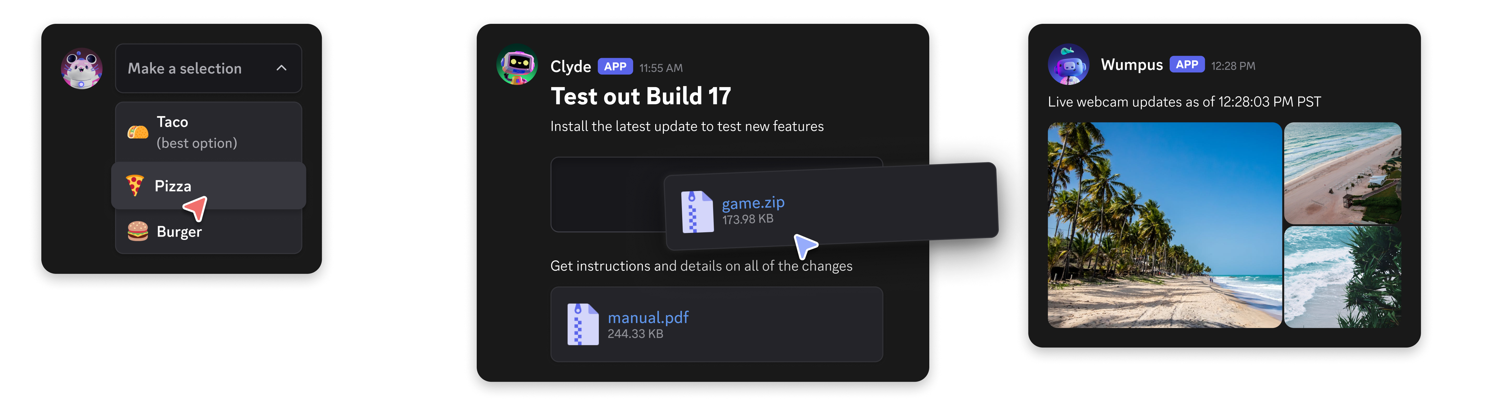
Components allow you to add interactive elements to modals and the messages your app sends. They're accessible, customizable, and easy to use. For an introduction to component types and modals, see the [Components & Modals](/developers/platform/components) platform page.
To use components, messages must be sent with the `IS_COMPONENTS_V2` flag (`1<<15`). Note that using this flag disables traditional content and embeds - all content must be sent as components instead.
[Legacy message component behavior](/developers/components/reference#legacy-message-component-behavior) will **not** be deprecated and will continue to be available to your apps on a message-by-message basis. However, we recommend using the new components for new projects and features.
}>
A guide on sending Message Components with examples.
}>
A guide on sending Modal Components with examples.
}>
Explore the Components reference documentation.
***
## Get Help & Join the Community
Do you have a question or want to connect with other app developers?
* Join our [DDevs Discord Server](https://discord.gg/discord-developers) and get help from the community, share best practices, and discover new ways to enhance your apps.
 To use components, messages must be sent with the `IS_COMPONENTS_V2` flag (`1<<15`). Note that using this flag disables traditional content and embeds - all content must be sent as components instead.