> ## Documentation Index
> Fetch the complete documentation index at: https://docs.discord.com/llms.txt
> Use this file to discover all available pages before exploring further.
# Component Reference
export const ManualAnchor = ({id}) => {
return ;
};
This document serves as a comprehensive reference for all available components. It covers three main categories:
* **Layout Components** - For organizing and structuring content (Action Rows, Sections, Containers)
* **Content Components** - For displaying static text, images, and files (Text Display, Media Gallery, Thumbnails)
* **Interactive Components** - For user interactions (Buttons, Select Menus, Text Input)
To use these components, you need to send the [message flag](/developers/resources/message#message-object-message-flags) `1 << 15` (IS\_COMPONENTS\_V2) which can be sent on a per-message basis. Once a message has been sent with this flag, it can't be removed from that message. This enables the new components system with the following changes:
* The `content` and `embeds` fields will no longer work but you'll be able to use [Text Display](/developers/components/reference#text-display) and [Container](/developers/components/reference#container) as replacements
* Attachments won't show by default - they must be exposed through components
* The `poll` and `stickers` fields are disabled
* Messages allow up to 40 total components
[Legacy component behavior](/developers/components/reference#legacy-message-component-behavior) will continue to work but provide less flexibility and control over the message layout.
For a practical guide on implementing these components, see our [Using Message Components](/developers/components/using-message-components) and [Using Modal Components](/developers/components/using-modal-components) documentation.
***
## What is a Component
Components allow you to style and structure your messages, modals, and interactions. They are interactive elements that can create rich user experiences in your Discord applications.
Components are a field on the [message object](/developers/resources/message#message-object) and [modal](/developers/interactions/receiving-and-responding#interaction-response-object-modal). You can use them when creating messages or responding to an interaction, like an [application command](/developers/interactions/application-commands).
### Component Object
###### Component Types
The following is a complete table of available components. Details about each component are in the sections below.
| Type | Name | Description | Style | Usage |
| ---- | ------------------------------------------------------------------------- | -------------------------------------------------------------- | ----------- | -------------- |
| 1 | [Action Row](/developers/components/reference#action-row) | Container to display a row of interactive components | Layout | Message |
| 2 | [Button](/developers/components/reference#button) | Button object | Interactive | Message |
| 3 | [String Select](/developers/components/reference#string-select) | Select menu for picking from defined text options | Interactive | Message, Modal |
| 4 | [Text Input](/developers/components/reference#text-input) | Text input object | Interactive | Modal |
| 5 | [User Select](/developers/components/reference#user-select) | Select menu for users | Interactive | Message, Modal |
| 6 | [Role Select](/developers/components/reference#role-select) | Select menu for roles | Interactive | Message, Modal |
| 7 | [Mentionable Select](/developers/components/reference#mentionable-select) | Select menu for mentionables (users *and* roles) | Interactive | Message, Modal |
| 8 | [Channel Select](/developers/components/reference#channel-select) | Select menu for channels | Interactive | Message, Modal |
| 9 | [Section](/developers/components/reference#section) | Container to display text alongside an accessory component | Layout | Message |
| 10 | [Text Display](/developers/components/reference#text-display) | Markdown text | Content | Message, Modal |
| 11 | [Thumbnail](/developers/components/reference#thumbnail) | Small image that can be used as an accessory | Content | Message |
| 12 | [Media Gallery](/developers/components/reference#media-gallery) | Display images and other media | Content | Message |
| 13 | [File](/developers/components/reference#file) | Displays an attached file | Content | Message |
| 14 | [Separator](/developers/components/reference#separator) | Component to add vertical padding between other components | Layout | Message |
| 17 | [Container](/developers/components/reference#container) | Container that visually groups a set of components | Layout | Message |
| 18 | [Label](/developers/components/reference#label) | Container associating a label and description with a component | Layout | Modal |
| 19 | [File Upload](/developers/components/reference#file-upload) | Component for uploading files | Interactive | Modal |
| 21 | [Radio Group](/developers/components/reference#radio-group) | Single-choice set of options | Interactive | Modal |
| 22 | [Checkbox Group](/developers/components/reference#checkbox-group) | Multi-selectable group of checkboxes | Interactive | Modal |
| 23 | [Checkbox](/developers/components/reference#checkbox) | Single checkbox for yes/no choice | Interactive | Modal |
***
## Anatomy of a Component
All components have the following fields:
| Field | Type | Description |
| ----- | ------- | ---------------------------------------------------------------------------------------------- |
| type | integer | The [type](/developers/components/reference#component-object-component-types) of the component |
| id? | integer | 32 bit integer used as an optional identifier for component |
The `id` field is optional and is used to identify components in the response from an interaction. The `id` must be unique within the message and is generated sequentially if left empty. Generation of `id`s won't use another `id` that exists in the message if you have one defined for another component. Sending components with an `id` of `0` is allowed but will be treated as empty and replaced by the API.
###### Custom ID
Additionally, interactive components like buttons and selects must have a `custom_id` field. The developer defines this field when sending the component payload, and it is returned in the interaction payload sent when a user interacts with the component. For example, if you set `custom_id: click_me` on a button, you'll receive an interaction containing `custom_id: click_me` when a user clicks that button.
`custom_id` is only available on interactive components and must be unique per component. Multiple components on the same message must not share the same `custom_id`. This field is a string of 1 to 100 characters and can be used flexibly to maintain state or pass through other important data.
| Field | Type | Description |
| ---------- | ------ | ---------------------------------------------- |
| custom\_id | string | Developer-defined identifier, 1-100 characters |
***
## Action Row
An Action Row is a top-level layout component.
Action Rows can contain one of the following:
* Up to 5 contextually grouped [buttons](/developers/components/reference#button)
* A single select component ([string select](/developers/components/reference#string-select), [user select](/developers/components/reference#user-select), [role select](/developers/components/reference#role-select), [mentionable select](/developers/components/reference#mentionable-select), or [channel select](/developers/components/reference#channel-select))
[Label](/developers/components/reference#label) is recommended for use over an Action Row in modals. Action Row with Text Inputs in modals are now deprecated.
###### Action Row Structure
| Field | Type | Description |
| ---------- | --------------------------------------------------------------------------------------------------------------- | ------------------------------------------------------------------------------------------------------------------------------------------------------------- |
| type | integer | `1` for action row component |
| id? | integer | Optional identifier for component |
| components | array of [action row child components](/developers/components/reference#action-row-action-row-child-components) | Up to 5 interactive [button](/developers/components/reference#button) components or a single [select](/developers/components/reference#user-select) component |
###### Action Row Child Components
| Available Components | Description |
| ------------------------------------------------------------------------- | ----------------------------------------- |
| [Button](/developers/components/reference#button) | An Action Row can contain up to 5 Buttons |
| [String Select](/developers/components/reference#string-select) | A single String Select |
| [User Select](/developers/components/reference#user-select) | A single User Select |
| [Role Select](/developers/components/reference#role-select) | A single Role Select |
| [Mentionable Select](/developers/components/reference#mentionable-select) | A single Mentionable Select |
| [Channel Select](/developers/components/reference#channel-select) | A single Channel Select |
###### Examples
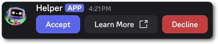 ```jsonc theme={"system"}
{
"flags": 32768,
"components": [
{
"type": 1, // ComponentType.ACTION_ROW
"components": [
{
"type": 2, // ComponentType.BUTTON
"custom_id": "click_yes",
"label": "Accept",
"style": 1
},
{
"type": 2, // ComponentType.BUTTON
"label": "Learn More",
"style": 5,
"url": "http://watchanimeattheoffice.com/"
},
{
"type": 2, // ComponentType.BUTTON
"custom_id": "click_no",
"label": "Decline",
"style": 4
}
]
}
]
}
```
***
## Button
A Button is an interactive component that can only be used in messages. It creates clickable elements that users can interact with, sending an [interaction](/developers/interactions/receiving-and-responding#interaction-object) to your app when clicked.
Buttons must be placed inside an [Action Row](/developers/components/reference#action-row) or a [Section](/developers/components/reference#section)'s `accessory` field.
###### Button Structure
| Field | Type | Description |
| ----------- | --------------------------------------------------------- | ------------------------------------------------------------------------------------------------------------------------- |
| type | integer | `2` for a button |
| id? | integer | Optional identifier for component |
| style | integer | A [button style](/developers/components/reference#button-button-styles) |
| label? | string | Text that appears on the button; max 80 characters |
| emoji? | partial [emoji](/developers/resources/emoji#emoji-object) | `name`, `id`, and `animated` |
| custom\_id? | string | Developer-defined identifier for the button; 1-100 characters |
| sku\_id? | snowflake | Identifier for a purchasable [SKU](/developers/resources/sku#sku-object), only available when using premium-style buttons |
| url? | string | URL for link-style buttons; max 512 characters |
| disabled? | boolean | Whether the button is disabled (defaults to `false`) |
Buttons come in various styles to convey different types of actions. These styles also define what fields are valid for a button.
* Non-link and non-premium buttons **must** have a `custom_id`, and cannot have a `url` or a `sku_id`.
* Link buttons **must** have a `url`, and cannot have a `custom_id`
* Link buttons do not send an [interaction](/developers/interactions/receiving-and-responding#interaction-object) to your app when clicked
* Premium buttons **must** contain a `sku_id`, and cannot have a `custom_id`, `label`, `url`, or `emoji`.
* Premium buttons do not send an [interaction](/developers/interactions/receiving-and-responding#interaction-object) to your app when clicked
###### Button Styles
| Name | Value | Action | Required Field |
| --------- | ----- | -------------------------------------------------------------- | -------------- |
| Primary | 1 | The most important or recommended action in a group of options | `custom_id` |
| Secondary | 2 | Alternative or supporting actions | `custom_id` |
| Success | 3 | Positive confirmation or completion actions | `custom_id` |
| Danger | 4 | An action with irreversible consequences | `custom_id` |
| Link | 5 | Navigates to a URL | `url` |
| Premium | 6 | Purchase | `sku_id` |
###### Examples
```jsonc theme={"system"}
{
"flags": 32768,
"components": [
{
"type": 1, // ComponentType.ACTION_ROW
"components": [
{
"type": 2, // ComponentType.BUTTON,
"custom_id": "click_me",
"label": "Click me!",
"style": 1
}
]
}
]
}
```
When a user interacts with a Button in a message, this is the basic form of the interaction data payload you will receive. The full payload
is available in the [interaction](/developers/interactions/receiving-and-responding#interaction-object-interaction-structure) reference.
```jsonc theme={"system"}
{
"type": 3, // InteractionType.MESSAGE_COMPONENT
...additionalInteractionFields, // See the Interaction documentation for all fields
"data": {
"component_type": 2, // ComponentType.BUTTON
"id": 2,
"custom_id": "click_me",
},
}
```
### Button Design Guidelines
###### General Button Content
* 34 characters max with icon or emoji.
* 38 characters max without icon or emoji.
* Keep text concise and to the point.
* Use clear and easily understandable language. Avoid jargon or overly technical terms.
* Use verbs that indicate the outcome of the action.
* Maintain consistency in language and tone across buttons.
* Anticipate the need for translation and test for expansion or contraction in different languages.
###### Multiple Buttons
Use different button styles to create a hierarchy. Use only one `Primary` button per group.
```jsonc theme={"system"}
{
"flags": 32768,
"components": [
{
"type": 1, // ComponentType.ACTION_ROW
"components": [
{
"type": 2, // ComponentType.BUTTON
"custom_id": "click_yes",
"label": "Accept",
"style": 1
},
{
"type": 2, // ComponentType.BUTTON
"label": "Learn More",
"style": 5,
"url": "http://watchanimeattheoffice.com/"
},
{
"type": 2, // ComponentType.BUTTON
"custom_id": "click_no",
"label": "Decline",
"style": 4
}
]
}
]
}
```
***
## Button
A Button is an interactive component that can only be used in messages. It creates clickable elements that users can interact with, sending an [interaction](/developers/interactions/receiving-and-responding#interaction-object) to your app when clicked.
Buttons must be placed inside an [Action Row](/developers/components/reference#action-row) or a [Section](/developers/components/reference#section)'s `accessory` field.
###### Button Structure
| Field | Type | Description |
| ----------- | --------------------------------------------------------- | ------------------------------------------------------------------------------------------------------------------------- |
| type | integer | `2` for a button |
| id? | integer | Optional identifier for component |
| style | integer | A [button style](/developers/components/reference#button-button-styles) |
| label? | string | Text that appears on the button; max 80 characters |
| emoji? | partial [emoji](/developers/resources/emoji#emoji-object) | `name`, `id`, and `animated` |
| custom\_id? | string | Developer-defined identifier for the button; 1-100 characters |
| sku\_id? | snowflake | Identifier for a purchasable [SKU](/developers/resources/sku#sku-object), only available when using premium-style buttons |
| url? | string | URL for link-style buttons; max 512 characters |
| disabled? | boolean | Whether the button is disabled (defaults to `false`) |
Buttons come in various styles to convey different types of actions. These styles also define what fields are valid for a button.
* Non-link and non-premium buttons **must** have a `custom_id`, and cannot have a `url` or a `sku_id`.
* Link buttons **must** have a `url`, and cannot have a `custom_id`
* Link buttons do not send an [interaction](/developers/interactions/receiving-and-responding#interaction-object) to your app when clicked
* Premium buttons **must** contain a `sku_id`, and cannot have a `custom_id`, `label`, `url`, or `emoji`.
* Premium buttons do not send an [interaction](/developers/interactions/receiving-and-responding#interaction-object) to your app when clicked
###### Button Styles
| Name | Value | Action | Required Field |
| --------- | ----- | -------------------------------------------------------------- | -------------- |
| Primary | 1 | The most important or recommended action in a group of options | `custom_id` |
| Secondary | 2 | Alternative or supporting actions | `custom_id` |
| Success | 3 | Positive confirmation or completion actions | `custom_id` |
| Danger | 4 | An action with irreversible consequences | `custom_id` |
| Link | 5 | Navigates to a URL | `url` |
| Premium | 6 | Purchase | `sku_id` |
###### Examples
```jsonc theme={"system"}
{
"flags": 32768,
"components": [
{
"type": 1, // ComponentType.ACTION_ROW
"components": [
{
"type": 2, // ComponentType.BUTTON,
"custom_id": "click_me",
"label": "Click me!",
"style": 1
}
]
}
]
}
```
When a user interacts with a Button in a message, this is the basic form of the interaction data payload you will receive. The full payload
is available in the [interaction](/developers/interactions/receiving-and-responding#interaction-object-interaction-structure) reference.
```jsonc theme={"system"}
{
"type": 3, // InteractionType.MESSAGE_COMPONENT
...additionalInteractionFields, // See the Interaction documentation for all fields
"data": {
"component_type": 2, // ComponentType.BUTTON
"id": 2,
"custom_id": "click_me",
},
}
```
### Button Design Guidelines
###### General Button Content
* 34 characters max with icon or emoji.
* 38 characters max without icon or emoji.
* Keep text concise and to the point.
* Use clear and easily understandable language. Avoid jargon or overly technical terms.
* Use verbs that indicate the outcome of the action.
* Maintain consistency in language and tone across buttons.
* Anticipate the need for translation and test for expansion or contraction in different languages.
###### Multiple Buttons
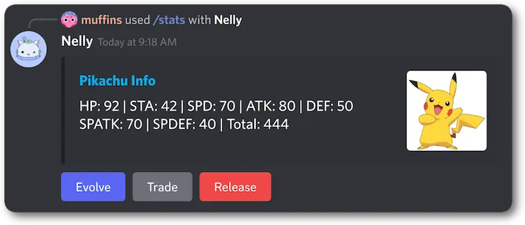
Use different button styles to create a hierarchy. Use only one `Primary` button per group.
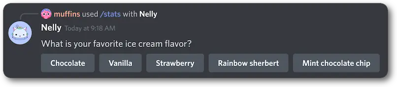
 If there are multiple buttons of equal significance, use the `Secondary` button style for all buttons.
 ###### Premium Buttons
Premium buttons will automatically have the following:
* Shop Icon
* SKU name
* SKU price
###### Premium Buttons
Premium buttons will automatically have the following:
* Shop Icon
* SKU name
* SKU price
 ***
## String Select
A String Select is an interactive component that allows users to select one or more provided `options`.
String Selects can be configured for both single-select and multi-select behavior. When a user finishes making their choice(s) your app receives an [interaction](/developers/interactions/receiving-and-responding#interaction-object-interaction-structure).
String Selects are available in messages and modals. They must be placed inside an [Action Row](/developers/components/reference#action-row) in messages and a [Label](/developers/components/reference#label) in modals.
###### String Select Structure
| Field | Type | Description |
| --------------- | ------------------------------------------------------------------------------------------------- | ------------------------------------------------------------------------------------- |
| type | integer | `3` for string select |
| id? | integer | Optional identifier for component |
| custom\_id | string | ID for the select menu; 1-100 characters |
| options | array of [select options](/developers/components/reference#string-select-select-option-structure) | Specified choices in a select menu; max 25 |
| placeholder? | string | Placeholder text if nothing is selected or default; max 150 characters |
| min\_values?\* | integer | Minimum number of items that must be chosen (defaults to 1); min 0 (see note), max 25 |
| max\_values? | integer | Maximum number of items that can be chosen (defaults to 1); max 25 |
| required?\*\* | boolean | Whether the string select is required to answer in a modal (defaults to `true`) |
| disabled?\*\*\* | boolean | Whether select menu is disabled in a message (defaults to `false`) |
\* `min_values` must be either omitted or at least `1` if `required` is omitted or `true`.
\*\* The `required` field is only available for String Selects in modals. It is ignored in messages.
\*\*\* Using `disabled` in a modal will result in an error. Modals can not currently have disabled components in them.
###### Select Option Structure
| Field | Type | Description |
| ------------ | ---------------------------------------------------------------- | -------------------------------------------------------- |
| label | string | User-facing name of the option; max 100 characters |
| value | string | Dev-defined value of the option; max 100 characters |
| description? | string | Additional description of the option; max 100 characters |
| emoji? | partial [emoji](/developers/resources/emoji#emoji-object) object | `id`, `name`, and `animated` |
| default? | boolean | Will show this option as selected by default |
###### String Select Interaction Response Structure
| Field | Type | Description |
| ----------------- | ---------------- | ------------------------------------------------------------ |
| type\* | integer | `3` for a String Select |
| component\_type\* | integer | `3` for a String Select |
| id | integer | Unique identifier for the component |
| custom\_id | string | Developer-defined identifier for the input; 1-100 characters |
| values | array of strings | The text of the selected options |
\* In message interaction responses `component_type` will be returned and in modal interaction responses `type` will be returned.
###### Examples
***
## String Select
A String Select is an interactive component that allows users to select one or more provided `options`.
String Selects can be configured for both single-select and multi-select behavior. When a user finishes making their choice(s) your app receives an [interaction](/developers/interactions/receiving-and-responding#interaction-object-interaction-structure).
String Selects are available in messages and modals. They must be placed inside an [Action Row](/developers/components/reference#action-row) in messages and a [Label](/developers/components/reference#label) in modals.
###### String Select Structure
| Field | Type | Description |
| --------------- | ------------------------------------------------------------------------------------------------- | ------------------------------------------------------------------------------------- |
| type | integer | `3` for string select |
| id? | integer | Optional identifier for component |
| custom\_id | string | ID for the select menu; 1-100 characters |
| options | array of [select options](/developers/components/reference#string-select-select-option-structure) | Specified choices in a select menu; max 25 |
| placeholder? | string | Placeholder text if nothing is selected or default; max 150 characters |
| min\_values?\* | integer | Minimum number of items that must be chosen (defaults to 1); min 0 (see note), max 25 |
| max\_values? | integer | Maximum number of items that can be chosen (defaults to 1); max 25 |
| required?\*\* | boolean | Whether the string select is required to answer in a modal (defaults to `true`) |
| disabled?\*\*\* | boolean | Whether select menu is disabled in a message (defaults to `false`) |
\* `min_values` must be either omitted or at least `1` if `required` is omitted or `true`.
\*\* The `required` field is only available for String Selects in modals. It is ignored in messages.
\*\*\* Using `disabled` in a modal will result in an error. Modals can not currently have disabled components in them.
###### Select Option Structure
| Field | Type | Description |
| ------------ | ---------------------------------------------------------------- | -------------------------------------------------------- |
| label | string | User-facing name of the option; max 100 characters |
| value | string | Dev-defined value of the option; max 100 characters |
| description? | string | Additional description of the option; max 100 characters |
| emoji? | partial [emoji](/developers/resources/emoji#emoji-object) object | `id`, `name`, and `animated` |
| default? | boolean | Will show this option as selected by default |
###### String Select Interaction Response Structure
| Field | Type | Description |
| ----------------- | ---------------- | ------------------------------------------------------------ |
| type\* | integer | `3` for a String Select |
| component\_type\* | integer | `3` for a String Select |
| id | integer | Unique identifier for the component |
| custom\_id | string | Developer-defined identifier for the input; 1-100 characters |
| values | array of strings | The text of the selected options |
\* In message interaction responses `component_type` will be returned and in modal interaction responses `type` will be returned.
###### Examples
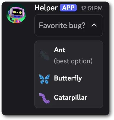 ```jsonc theme={"system"}
{
"flags": 32768,
"components": [
{
"type": 1, // ComponentType.ACTION_ROW,
"id": 1,
"components": [
{
"type": 3, // ComponentType.STRING_SELECT
"id": 2,
"custom_id": "favorite_bug",
"placeholder": "Favorite bug?",
"options": [
{
"label": "Ant",
"value": "ant",
"description": "(best option)",
"emoji": {"name": "🐜"}
},
{
"label": "Butterfly",
"value": "butterfly",
"emoji": {"name": "🦋"}
},
{
"label": "Caterpillar",
"value": "caterpillar",
"emoji": {"name": "🐛"}
}
]
}
]
}
]
}
```
When a user interacts with a StringSelect in a message, this is the basic form of the interaction data payload you will receive. The full payload
is available in the [interaction](/developers/interactions/receiving-and-responding#interaction-object-interaction-structure) reference.
```jsonc theme={"system"}
{
"type": 3, // InteractionType.MESSAGE_COMPONENT
...additionalInteractionFields, // See the Interaction documentation for all fields
"data": {
"component_type": 3, // ComponentType.STRING_SELECT
"custom_id": "favorite_bug",
"values": [
"butterfly",
]
},
}
```
```jsonc theme={"system"}
{
"flags": 32768,
"components": [
{
"type": 1, // ComponentType.ACTION_ROW,
"id": 1,
"components": [
{
"type": 3, // ComponentType.STRING_SELECT
"id": 2,
"custom_id": "favorite_bug",
"placeholder": "Favorite bug?",
"options": [
{
"label": "Ant",
"value": "ant",
"description": "(best option)",
"emoji": {"name": "🐜"}
},
{
"label": "Butterfly",
"value": "butterfly",
"emoji": {"name": "🦋"}
},
{
"label": "Caterpillar",
"value": "caterpillar",
"emoji": {"name": "🐛"}
}
]
}
]
}
]
}
```
When a user interacts with a StringSelect in a message, this is the basic form of the interaction data payload you will receive. The full payload
is available in the [interaction](/developers/interactions/receiving-and-responding#interaction-object-interaction-structure) reference.
```jsonc theme={"system"}
{
"type": 3, // InteractionType.MESSAGE_COMPONENT
...additionalInteractionFields, // See the Interaction documentation for all fields
"data": {
"component_type": 3, // ComponentType.STRING_SELECT
"custom_id": "favorite_bug",
"values": [
"butterfly",
]
},
}
```
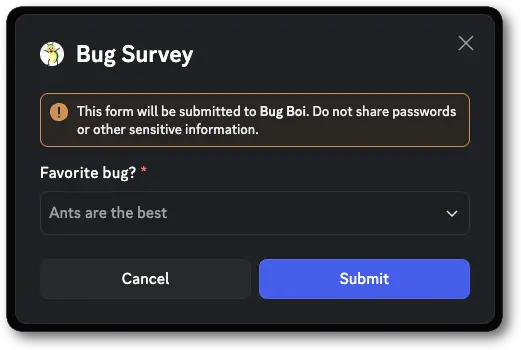 ```jsonc theme={"system"}
{
"type": 9, // InteractionCallbackType.MODAL
"data": {
"custom_id": "bug_modal",
"title": "Bug Survey",
"components": [
{
"type": 18, // ComponentType.LABEL
"id": 1,
"label": "Favorite bug?",
"component": {
"type": 3, // ComponentType.STRING_SELECT
"id": 2,
"custom_id": "favorite_bug",
"placeholder": "Ants are the best",
"options": [
{
"label": "Ant",
"value": "ant",
"description": "(best option)",
"emoji": {"name": "🐜"}
},
{
"label": "Butterfly",
"value": "butterfly",
"emoji": {"name": "🦋"}
},
{
"label": "Caterpillar",
"value": "caterpillar",
"emoji": {"name": "🐛"}
}
]
}
}
]
}
}
```
When a user submits a modal that contains a String Select, this is the basic form of the interaction data payload you will receive. The full payload
is available in the [interaction](/developers/interactions/receiving-and-responding#interaction-object-interaction-structure) reference.
```jsonc theme={"system"}
{
"type": 5, // InteractionType.MODAL_SUBMIT
...additionalInteractionFields, // See the Interaction documentation for all fields
"data": {
"custom_id": "bug_modal",
"components": [
{
"type": 18, // ComponentType.LABEL
"id": 1,
"component": {
"type": 3, // ComponentType.STRING_SELECT
"id": 2,
"custom_id": "favorite_bug",
"values": [
"butterfly",
]
}
}
]
},
}
```
***
## Text Input
Text Input is an interactive component that allows users to enter free-form text responses in modals. It supports both short, single-line inputs and longer, multi-line paragraph inputs.
Text Inputs can only be used within modals and must be placed inside a [Label](/developers/components/reference#label).
We no longer recommend using Text Input within an [Action Row](/developers/components/reference#action-row) in modals. Going forward all Text Inputs should be placed inside a [Label](/developers/components/reference#label) component.
###### Text Input Structure
| Field | Type | Description |
| ------------ | ------- | ------------------------------------------------------------------------------------- |
| type | integer | `4` for a text input |
| id? | integer | Optional identifier for component |
| custom\_id | string | Developer-defined identifier for the input; 1-100 characters |
| style | integer | The [Text Input Style](/developers/components/reference#text-input-text-input-styles) |
| min\_length? | integer | Minimum input length for a text input; min 0, max 4000 |
| max\_length? | integer | Maximum input length for a text input; min 1, max 4000 |
| required? | boolean | Whether this component is required to be filled (defaults to `true`) |
| value? | string | Pre-filled value for this component; max 4000 characters |
| placeholder? | string | Custom placeholder text if the input is empty; max 100 characters |
The `label` field on a Text Input is deprecated in favor of `label` and `description` on the [Label](/developers/components/reference#label) component.
###### Text Input Styles
| Name | Value | Description |
| --------- | ----- | ----------------- |
| Short | 1 | Single-line input |
| Paragraph | 2 | Multi-line input |
###### Text Input Interaction Response Structure
| Field | Type | Description |
| ---------- | ------- | ------------------------------------------------------------ |
| type | integer | `4` for a Text Input |
| id | integer | Unique identifier for the component |
| custom\_id | string | Developer-defined identifier for the input; 1-100 characters |
| value | string | The user's input text |
###### Examples
```jsonc theme={"system"}
{
"type": 9, // InteractionCallbackType.MODAL
"data": {
"custom_id": "bug_modal",
"title": "Bug Survey",
"components": [
{
"type": 18, // ComponentType.LABEL
"id": 1,
"label": "Favorite bug?",
"component": {
"type": 3, // ComponentType.STRING_SELECT
"id": 2,
"custom_id": "favorite_bug",
"placeholder": "Ants are the best",
"options": [
{
"label": "Ant",
"value": "ant",
"description": "(best option)",
"emoji": {"name": "🐜"}
},
{
"label": "Butterfly",
"value": "butterfly",
"emoji": {"name": "🦋"}
},
{
"label": "Caterpillar",
"value": "caterpillar",
"emoji": {"name": "🐛"}
}
]
}
}
]
}
}
```
When a user submits a modal that contains a String Select, this is the basic form of the interaction data payload you will receive. The full payload
is available in the [interaction](/developers/interactions/receiving-and-responding#interaction-object-interaction-structure) reference.
```jsonc theme={"system"}
{
"type": 5, // InteractionType.MODAL_SUBMIT
...additionalInteractionFields, // See the Interaction documentation for all fields
"data": {
"custom_id": "bug_modal",
"components": [
{
"type": 18, // ComponentType.LABEL
"id": 1,
"component": {
"type": 3, // ComponentType.STRING_SELECT
"id": 2,
"custom_id": "favorite_bug",
"values": [
"butterfly",
]
}
}
]
},
}
```
***
## Text Input
Text Input is an interactive component that allows users to enter free-form text responses in modals. It supports both short, single-line inputs and longer, multi-line paragraph inputs.
Text Inputs can only be used within modals and must be placed inside a [Label](/developers/components/reference#label).
We no longer recommend using Text Input within an [Action Row](/developers/components/reference#action-row) in modals. Going forward all Text Inputs should be placed inside a [Label](/developers/components/reference#label) component.
###### Text Input Structure
| Field | Type | Description |
| ------------ | ------- | ------------------------------------------------------------------------------------- |
| type | integer | `4` for a text input |
| id? | integer | Optional identifier for component |
| custom\_id | string | Developer-defined identifier for the input; 1-100 characters |
| style | integer | The [Text Input Style](/developers/components/reference#text-input-text-input-styles) |
| min\_length? | integer | Minimum input length for a text input; min 0, max 4000 |
| max\_length? | integer | Maximum input length for a text input; min 1, max 4000 |
| required? | boolean | Whether this component is required to be filled (defaults to `true`) |
| value? | string | Pre-filled value for this component; max 4000 characters |
| placeholder? | string | Custom placeholder text if the input is empty; max 100 characters |
The `label` field on a Text Input is deprecated in favor of `label` and `description` on the [Label](/developers/components/reference#label) component.
###### Text Input Styles
| Name | Value | Description |
| --------- | ----- | ----------------- |
| Short | 1 | Single-line input |
| Paragraph | 2 | Multi-line input |
###### Text Input Interaction Response Structure
| Field | Type | Description |
| ---------- | ------- | ------------------------------------------------------------ |
| type | integer | `4` for a Text Input |
| id | integer | Unique identifier for the component |
| custom\_id | string | Developer-defined identifier for the input; 1-100 characters |
| value | string | The user's input text |
###### Examples
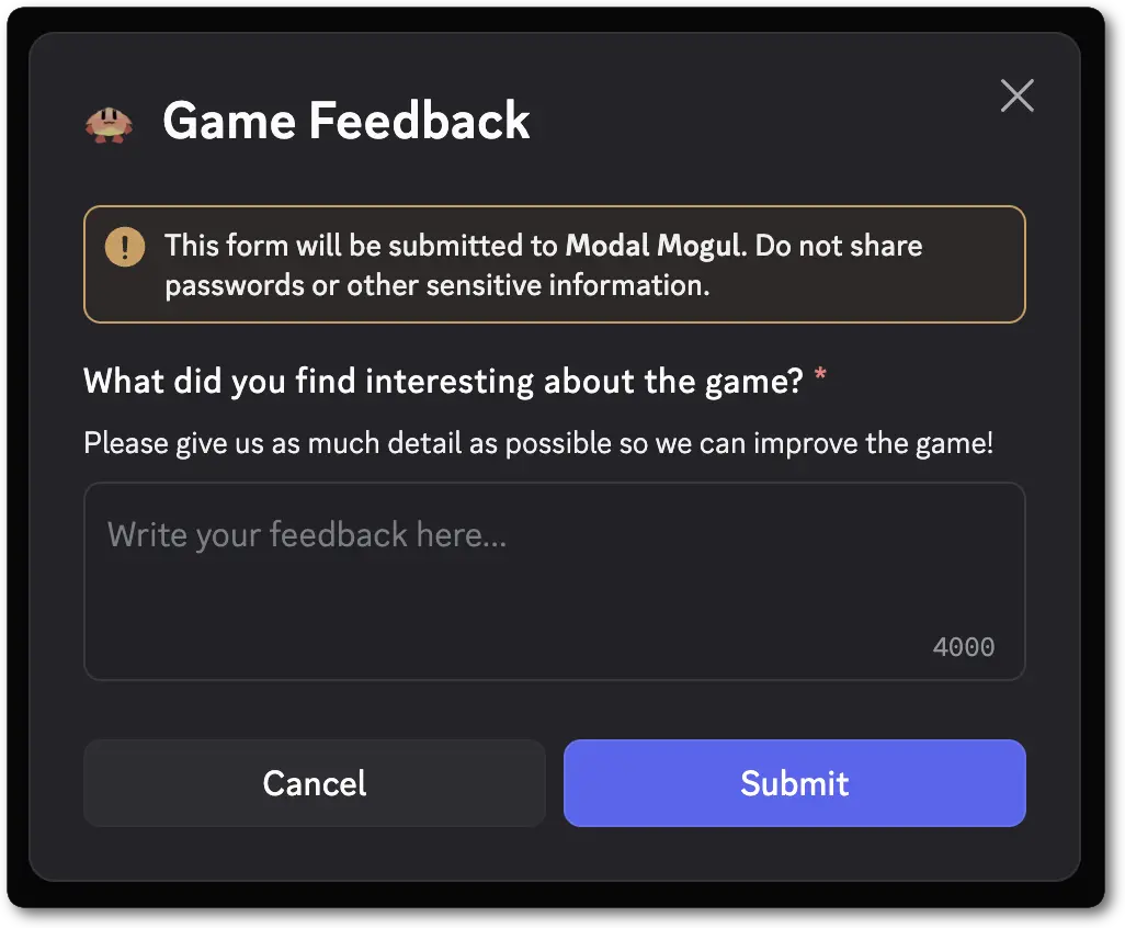 ```jsonc theme={"system"}
{
"type": 9, // InteractionCallbackType.MODAL
"data": {
"custom_id": "game_feedback_modal",
"title": "Game Feedback",
"components": [
{
"type": 18, // ComponentType.LABEL
"label": "What did you find interesting about the game?",
"description": "Please give us as much detail as possible so we can improve the game!",
"component": {
"type": 4, // ComponentType.TEXT_INPUT
"custom_id": "game_feedback",
"style": 2,
"min_length": 100,
"max_length": 4000,
"placeholder": "Write your feedback here...",
"required": true
}
}
]
}
}
```
When a user submits a modal that contains a TextInput, this is the basic form of the interaction data payload you will receive. The full payload
is available in the [interaction](/developers/interactions/receiving-and-responding#interaction-object-interaction-structure) reference.
```jsonc theme={"system"}
{
"type": 5, // InteractionType.MODAL_SUBMIT
...additionalInteractionFields, // See the Interaction documentation for all fields
"data": {
"custom_id": "game_feedback_modal",
"components": [
{
"type": 18, // ComponentType.LABEL
"id": 1,
"component": {
"type": 4, // ComponentType.TEXT_INPUT
"id": 2,
"custom_id": "game_feedback",
"value": "The recent changes to acceleration feel much better, but shadows still need help"
}
}
]
},
}
```
***
## User Select
A User Select is an interactive component that allows users to select one or more users in a message or modal. Options are automatically populated based on the server's available users.
User Selects can be configured for both single-select and multi-select behavior. When a user finishes making their choice(s) your app receives an [interaction](/developers/interactions/receiving-and-responding#interaction-object-interaction-structure).
User Selects are available in messages and modals. They must be placed inside an [Action Row](/developers/components/reference#action-row) in messages and a [Label](/developers/components/reference#label) in modals.
###### User Select Structure
| Field | Type | Description |
| ---------------- | ------------------------------------------------------------------------------------------------------------- | -------------------------------------------------------------------------------------------------------------------------------------------------------- |
| type | integer | `5` for user select |
| id? | integer | Optional identifier for component |
| custom\_id | string | ID for the select menu; 1-100 characters |
| placeholder? | string | Placeholder text if nothing is selected; max 150 characters |
| default\_values? | array of [default value objects](/developers/components/reference#user-select-select-default-value-structure) | List of default values for auto-populated select menu components; number of default values must be in the range defined by `min_values` and `max_values` |
| min\_values?\* | integer | Minimum number of items that must be chosen (defaults to 1); min 0 (see note), max 25 |
| max\_values? | integer | Maximum number of items that can be chosen (defaults to 1); max 25 |
| required?\*\* | boolean | Whether the user select is required to answer in a modal (defaults to `true`) |
| disabled?\*\*\* | boolean | Whether select menu is disabled in a message (defaults to `false`) |
\* `min_values` must be either omitted or at least `1` if `required` is omitted or `true`.
\*\* The `required` field is only available for User Selects in modals. It is ignored in messages.
\*\*\* Using `disabled` in a modal will result in an error. Modals can not currently have disabled components in them.
###### Select Default Value Structure
| Field | Type | Description |
| ----- | --------- | ----------------------------------------------------------------------------- |
| id | snowflake | ID of a user, role, or channel |
| type | string | Type of value that `id` represents. Either `"user"`, `"role"`, or `"channel"` |
###### User Select Interaction Response Structure
| Field | Type | Description |
| ----------------- | ------------------------------------------------------------------------------------------------------------- | ------------------------------------------------------------ |
| type\* | integer | `5` for a User Select |
| component\_type\* | integer | `5` for a User Select |
| id | integer | Unique identifier for the component |
| custom\_id | string | Developer-defined identifier for the input; 1-100 characters |
| resolved | [resolved data](/developers/interactions/receiving-and-responding#interaction-object-resolved-data-structure) | Resolved entities from selected options |
| values | array of snowflakes | IDs of the selected users |
\* In message interaction responses `component_type` will be returned and in modal interaction responses `type` will be returned.
###### Examples
```jsonc theme={"system"}
{
"type": 9, // InteractionCallbackType.MODAL
"data": {
"custom_id": "game_feedback_modal",
"title": "Game Feedback",
"components": [
{
"type": 18, // ComponentType.LABEL
"label": "What did you find interesting about the game?",
"description": "Please give us as much detail as possible so we can improve the game!",
"component": {
"type": 4, // ComponentType.TEXT_INPUT
"custom_id": "game_feedback",
"style": 2,
"min_length": 100,
"max_length": 4000,
"placeholder": "Write your feedback here...",
"required": true
}
}
]
}
}
```
When a user submits a modal that contains a TextInput, this is the basic form of the interaction data payload you will receive. The full payload
is available in the [interaction](/developers/interactions/receiving-and-responding#interaction-object-interaction-structure) reference.
```jsonc theme={"system"}
{
"type": 5, // InteractionType.MODAL_SUBMIT
...additionalInteractionFields, // See the Interaction documentation for all fields
"data": {
"custom_id": "game_feedback_modal",
"components": [
{
"type": 18, // ComponentType.LABEL
"id": 1,
"component": {
"type": 4, // ComponentType.TEXT_INPUT
"id": 2,
"custom_id": "game_feedback",
"value": "The recent changes to acceleration feel much better, but shadows still need help"
}
}
]
},
}
```
***
## User Select
A User Select is an interactive component that allows users to select one or more users in a message or modal. Options are automatically populated based on the server's available users.
User Selects can be configured for both single-select and multi-select behavior. When a user finishes making their choice(s) your app receives an [interaction](/developers/interactions/receiving-and-responding#interaction-object-interaction-structure).
User Selects are available in messages and modals. They must be placed inside an [Action Row](/developers/components/reference#action-row) in messages and a [Label](/developers/components/reference#label) in modals.
###### User Select Structure
| Field | Type | Description |
| ---------------- | ------------------------------------------------------------------------------------------------------------- | -------------------------------------------------------------------------------------------------------------------------------------------------------- |
| type | integer | `5` for user select |
| id? | integer | Optional identifier for component |
| custom\_id | string | ID for the select menu; 1-100 characters |
| placeholder? | string | Placeholder text if nothing is selected; max 150 characters |
| default\_values? | array of [default value objects](/developers/components/reference#user-select-select-default-value-structure) | List of default values for auto-populated select menu components; number of default values must be in the range defined by `min_values` and `max_values` |
| min\_values?\* | integer | Minimum number of items that must be chosen (defaults to 1); min 0 (see note), max 25 |
| max\_values? | integer | Maximum number of items that can be chosen (defaults to 1); max 25 |
| required?\*\* | boolean | Whether the user select is required to answer in a modal (defaults to `true`) |
| disabled?\*\*\* | boolean | Whether select menu is disabled in a message (defaults to `false`) |
\* `min_values` must be either omitted or at least `1` if `required` is omitted or `true`.
\*\* The `required` field is only available for User Selects in modals. It is ignored in messages.
\*\*\* Using `disabled` in a modal will result in an error. Modals can not currently have disabled components in them.
###### Select Default Value Structure
| Field | Type | Description |
| ----- | --------- | ----------------------------------------------------------------------------- |
| id | snowflake | ID of a user, role, or channel |
| type | string | Type of value that `id` represents. Either `"user"`, `"role"`, or `"channel"` |
###### User Select Interaction Response Structure
| Field | Type | Description |
| ----------------- | ------------------------------------------------------------------------------------------------------------- | ------------------------------------------------------------ |
| type\* | integer | `5` for a User Select |
| component\_type\* | integer | `5` for a User Select |
| id | integer | Unique identifier for the component |
| custom\_id | string | Developer-defined identifier for the input; 1-100 characters |
| resolved | [resolved data](/developers/interactions/receiving-and-responding#interaction-object-resolved-data-structure) | Resolved entities from selected options |
| values | array of snowflakes | IDs of the selected users |
\* In message interaction responses `component_type` will be returned and in modal interaction responses `type` will be returned.
###### Examples
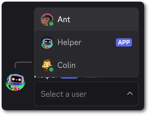 ```jsonc theme={"system"}
{
"flags": 32768,
"components": [
{
"type": 1, // ComponentType.ACTION_ROW
"components": [
{
"type": 5, // ComponentType.USER_SELECT
"custom_id": "user_select",
"placeholder": "Select a user"
}
]
}
]
}
```
When a user interacts with a User Select in a message, this is the basic form of the interaction data payload you will receive. The full payload
is available in the [interaction](/developers/interactions/receiving-and-responding#interaction-object-interaction-structure) reference.
`members` and `users` may both be present in the `resolved` object when a user is selected.
```jsonc theme={"system"}
{
"type": 3, // InteractionType.MESSAGE_COMPONENT
...additionalInteractionFields, // See the Interaction documentation for all fields
"data": {
"component_type": 5, // ComponentType.USER_SELECT
"id": 2,
"custom_id": "user_select",
"values": [
"1111111111111111111",
],
"resolved": {
"members": {
"1111111111111111111": {
"avatar": null,
"banner": null,
"collectibles": null,
"communication_disabled_until": null,
"flags": 0,
"joined_at": "2025-05-16T22:51:16.692000+00:00",
"nick": null,
"pending": false,
"permissions": "2248473465835073",
"premium_since": null,
"roles": [
"2222222222222222222"
],
"unusual_dm_activity_until": null
}
},
"users": {
"1111111111111111111": {
"avatar": "d54e87d20539fe9aad2f2cebe56809a2",
"avatar_decoration_data": null,
"bot": true,
"clan": null,
"collectibles": null,
"discriminator": "9062",
"display_name_styles": null,
"global_name": null,
"id": "1111111111111111111",
"primary_guild": null,
"public_flags": 524289,
"username": "ExampleBot"
}
}
}
},
}
```
```jsonc theme={"system"}
{
"flags": 32768,
"components": [
{
"type": 1, // ComponentType.ACTION_ROW
"components": [
{
"type": 5, // ComponentType.USER_SELECT
"custom_id": "user_select",
"placeholder": "Select a user"
}
]
}
]
}
```
When a user interacts with a User Select in a message, this is the basic form of the interaction data payload you will receive. The full payload
is available in the [interaction](/developers/interactions/receiving-and-responding#interaction-object-interaction-structure) reference.
`members` and `users` may both be present in the `resolved` object when a user is selected.
```jsonc theme={"system"}
{
"type": 3, // InteractionType.MESSAGE_COMPONENT
...additionalInteractionFields, // See the Interaction documentation for all fields
"data": {
"component_type": 5, // ComponentType.USER_SELECT
"id": 2,
"custom_id": "user_select",
"values": [
"1111111111111111111",
],
"resolved": {
"members": {
"1111111111111111111": {
"avatar": null,
"banner": null,
"collectibles": null,
"communication_disabled_until": null,
"flags": 0,
"joined_at": "2025-05-16T22:51:16.692000+00:00",
"nick": null,
"pending": false,
"permissions": "2248473465835073",
"premium_since": null,
"roles": [
"2222222222222222222"
],
"unusual_dm_activity_until": null
}
},
"users": {
"1111111111111111111": {
"avatar": "d54e87d20539fe9aad2f2cebe56809a2",
"avatar_decoration_data": null,
"bot": true,
"clan": null,
"collectibles": null,
"discriminator": "9062",
"display_name_styles": null,
"global_name": null,
"id": "1111111111111111111",
"primary_guild": null,
"public_flags": 524289,
"username": "ExampleBot"
}
}
}
},
}
```
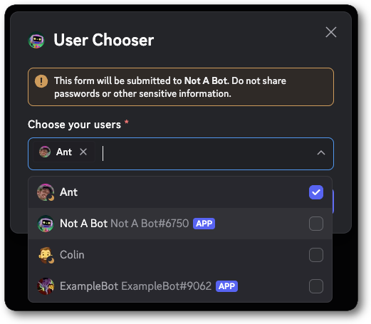 ```jsonc theme={"system"}
{
"type": 9,
"data": {
"custom_id": "user_modal",
"title": "User Chooser",
"components": [
{
"type": 18, // ComponentType.LABEL
"label": "Choose your users",
"component": {
"type": 5, // ComponentType.USER_SELECT
"custom_id": "user_selected",
"max_values": 5,
"required": true
}
}
]
}
}
```
When a user submits a modal that contains a User Select, this is the basic form of the interaction data payload you will receive. The full payload
is available in the [interaction](/developers/interactions/receiving-and-responding#interaction-object-interaction-structure) reference.
```jsonc theme={"system"}
{
"type": 5, // InteractionType.MODAL_SUBMIT
...additionalInteractionFields, // See the Interaction documentation for all fields
"data": {
"custom_id": "user_modal",
"components": [
{
"component": {
"custom_id": "user_selected",
"id": 2,
"type": 5,
"values": [
"11111111111111111"
]
},
"id": 1,
"type": 18
}
],
"resolved": {
"members": {
"11111111111111111": {
"avatar": null,
"banner": null,
"collectibles": null,
"communication_disabled_until": null,
"flags": 0,
"joined_at": "2025-04-02T23:07:21.476000+00:00",
"nick": "Ant",
"pending": false,
"permissions": "4503599627370495",
"premium_since": null,
"roles": [
"1357409927680889032"
],
"unusual_dm_activity_until": null
}
},
"users": {
"11111111111111111": {
"avatar": "a_b15bd8ee42e3c3d9a7de129fee60bc84",
"avatar_decoration_data": null,
"clan": null,
"collectibles": {
"nameplate": {
"asset": "nameplates/spell/white_mana/",
"expires_at": null,
"label": "COLLECTIBLES_SPELL_WHITE_MANA_NP_A11Y",
"palette": "bubble_gum",
"sku_id": "1379220459203072050"
}
},
"discriminator": "0",
"display_name_styles": {
"colors": [
16777215
],
"effect_id": 4,
"font_id": 3
},
"global_name": "Anthony",
"id": "11111111111111111",
"primary_guild": null,
"public_flags": 65,
"username": "actuallyanthony"
}
}
}
}
}
```
***
## Role Select
A Role Select is an interactive component that allows users to select one or more roles in a message or modal. Options are automatically populated based on the server's available roles.
Role Selects can be configured for both single-select and multi-select behavior. When a user finishes making their choice(s) your app receives an [interaction](/developers/interactions/receiving-and-responding#interaction-object-interaction-structure).
Role Selects are available in messages and modals. They must be placed inside an [Action Row](/developers/components/reference#action-row) in messages and a [Label](/developers/components/reference#label) in modals.
###### Role Select Structure
| Field | Type | Description |
| ---------------- | ------------------------------------------------------------------------------------------------------------- | -------------------------------------------------------------------------------------------------------------------------------------------------------- |
| type | integer | `6` for role select |
| id? | integer | Optional identifier for component |
| custom\_id | string | ID for the select menu; 1-100 characters |
| placeholder? | string | Placeholder text if nothing is selected; max 150 characters |
| default\_values? | array of [default value objects](/developers/components/reference#user-select-select-default-value-structure) | List of default values for auto-populated select menu components; number of default values must be in the range defined by `min_values` and `max_values` |
| min\_values?\* | integer | Minimum number of items that must be chosen (defaults to 1); min 0 (see note), max 25 |
| max\_values? | integer | Maximum number of items that can be chosen (defaults to 1); max 25 |
| required?\*\* | boolean | Whether the role select is required to answer in a modal (defaults to `true`) |
| disabled?\*\*\* | boolean | Whether select menu is disabled in a message (defaults to `false`) |
\* `min_values` must be either omitted or at least `1` if `required` is omitted or `true`.
\*\* The `required` field is only available for Role Selects in modals. It is ignored in messages.
\*\*\* Using `disabled` in a modal will result in an error. Modals can not currently have disabled components in them.
###### Role Select Interaction Response Structure
| Field | Type | Description |
| ----------------- | ------------------------------------------------------------------------------------------------------------- | ------------------------------------------------------------ |
| type\* | integer | `6` for a Role Select |
| component\_type\* | integer | `6` for a Role Select |
| id | integer | Unique identifier for the component |
| custom\_id | string | Developer-defined identifier for the input; 1-100 characters |
| resolved | [resolved data](/developers/interactions/receiving-and-responding#interaction-object-resolved-data-structure) | Resolved entities from selected options |
| values | array of snowflakes | IDs of the selected roles |
\* In message interaction responses `component_type` will be returned and in modal interaction responses `type` will be returned.
###### Examples
```jsonc theme={"system"}
{
"type": 9,
"data": {
"custom_id": "user_modal",
"title": "User Chooser",
"components": [
{
"type": 18, // ComponentType.LABEL
"label": "Choose your users",
"component": {
"type": 5, // ComponentType.USER_SELECT
"custom_id": "user_selected",
"max_values": 5,
"required": true
}
}
]
}
}
```
When a user submits a modal that contains a User Select, this is the basic form of the interaction data payload you will receive. The full payload
is available in the [interaction](/developers/interactions/receiving-and-responding#interaction-object-interaction-structure) reference.
```jsonc theme={"system"}
{
"type": 5, // InteractionType.MODAL_SUBMIT
...additionalInteractionFields, // See the Interaction documentation for all fields
"data": {
"custom_id": "user_modal",
"components": [
{
"component": {
"custom_id": "user_selected",
"id": 2,
"type": 5,
"values": [
"11111111111111111"
]
},
"id": 1,
"type": 18
}
],
"resolved": {
"members": {
"11111111111111111": {
"avatar": null,
"banner": null,
"collectibles": null,
"communication_disabled_until": null,
"flags": 0,
"joined_at": "2025-04-02T23:07:21.476000+00:00",
"nick": "Ant",
"pending": false,
"permissions": "4503599627370495",
"premium_since": null,
"roles": [
"1357409927680889032"
],
"unusual_dm_activity_until": null
}
},
"users": {
"11111111111111111": {
"avatar": "a_b15bd8ee42e3c3d9a7de129fee60bc84",
"avatar_decoration_data": null,
"clan": null,
"collectibles": {
"nameplate": {
"asset": "nameplates/spell/white_mana/",
"expires_at": null,
"label": "COLLECTIBLES_SPELL_WHITE_MANA_NP_A11Y",
"palette": "bubble_gum",
"sku_id": "1379220459203072050"
}
},
"discriminator": "0",
"display_name_styles": {
"colors": [
16777215
],
"effect_id": 4,
"font_id": 3
},
"global_name": "Anthony",
"id": "11111111111111111",
"primary_guild": null,
"public_flags": 65,
"username": "actuallyanthony"
}
}
}
}
}
```
***
## Role Select
A Role Select is an interactive component that allows users to select one or more roles in a message or modal. Options are automatically populated based on the server's available roles.
Role Selects can be configured for both single-select and multi-select behavior. When a user finishes making their choice(s) your app receives an [interaction](/developers/interactions/receiving-and-responding#interaction-object-interaction-structure).
Role Selects are available in messages and modals. They must be placed inside an [Action Row](/developers/components/reference#action-row) in messages and a [Label](/developers/components/reference#label) in modals.
###### Role Select Structure
| Field | Type | Description |
| ---------------- | ------------------------------------------------------------------------------------------------------------- | -------------------------------------------------------------------------------------------------------------------------------------------------------- |
| type | integer | `6` for role select |
| id? | integer | Optional identifier for component |
| custom\_id | string | ID for the select menu; 1-100 characters |
| placeholder? | string | Placeholder text if nothing is selected; max 150 characters |
| default\_values? | array of [default value objects](/developers/components/reference#user-select-select-default-value-structure) | List of default values for auto-populated select menu components; number of default values must be in the range defined by `min_values` and `max_values` |
| min\_values?\* | integer | Minimum number of items that must be chosen (defaults to 1); min 0 (see note), max 25 |
| max\_values? | integer | Maximum number of items that can be chosen (defaults to 1); max 25 |
| required?\*\* | boolean | Whether the role select is required to answer in a modal (defaults to `true`) |
| disabled?\*\*\* | boolean | Whether select menu is disabled in a message (defaults to `false`) |
\* `min_values` must be either omitted or at least `1` if `required` is omitted or `true`.
\*\* The `required` field is only available for Role Selects in modals. It is ignored in messages.
\*\*\* Using `disabled` in a modal will result in an error. Modals can not currently have disabled components in them.
###### Role Select Interaction Response Structure
| Field | Type | Description |
| ----------------- | ------------------------------------------------------------------------------------------------------------- | ------------------------------------------------------------ |
| type\* | integer | `6` for a Role Select |
| component\_type\* | integer | `6` for a Role Select |
| id | integer | Unique identifier for the component |
| custom\_id | string | Developer-defined identifier for the input; 1-100 characters |
| resolved | [resolved data](/developers/interactions/receiving-and-responding#interaction-object-resolved-data-structure) | Resolved entities from selected options |
| values | array of snowflakes | IDs of the selected roles |
\* In message interaction responses `component_type` will be returned and in modal interaction responses `type` will be returned.
###### Examples
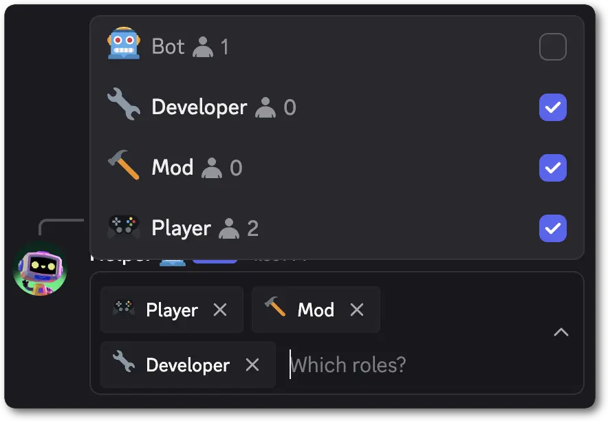 ```jsonc theme={"system"}
{
"flags": 32768,
"components": [
{
"type": 1, // ComponentType.ACTION_ROW
"components": [
{
"type": 6, // ComponentType.ROLE_SELECT
"custom_id": "role_ids",
"placeholder": "Which roles?",
"min_values": 1,
"max_values": 3
}
]
}
]
}
```
When a user interacts with a Role Select in a message, this is the basic form of the interaction data payload you will receive. The full payload
is available in the [interaction](/developers/interactions/receiving-and-responding#interaction-object-interaction-structure) reference.
```jsonc theme={"system"}
{
"type": 3, // InteractionType.MESSAGE_COMPONENT
...additionalInteractionFields, // See the Interaction documentation for all fields
"data": {
"component_type": 6, // ComponentType.ROLE_SELECT
"id": 2,
"custom_id": "role_ids",
"values": [
"222222222222222222",
],
"resolved": {
"roles": {
"222222222222222222": {
"color": 12745742,
"colors": {
"primary_color": 12745742,
"secondary_color": null,
"tertiary_color": null
},
"description": null,
"flags": 0,
"hoist": false,
"icon": null,
"id": "222222222222222222",
"managed": false,
"mentionable": true,
"name": "Developer",
"permissions": "0",
"position": 2,
"unicode_emoji": "🔧"
}
}
}
},
}
```
```jsonc theme={"system"}
{
"flags": 32768,
"components": [
{
"type": 1, // ComponentType.ACTION_ROW
"components": [
{
"type": 6, // ComponentType.ROLE_SELECT
"custom_id": "role_ids",
"placeholder": "Which roles?",
"min_values": 1,
"max_values": 3
}
]
}
]
}
```
When a user interacts with a Role Select in a message, this is the basic form of the interaction data payload you will receive. The full payload
is available in the [interaction](/developers/interactions/receiving-and-responding#interaction-object-interaction-structure) reference.
```jsonc theme={"system"}
{
"type": 3, // InteractionType.MESSAGE_COMPONENT
...additionalInteractionFields, // See the Interaction documentation for all fields
"data": {
"component_type": 6, // ComponentType.ROLE_SELECT
"id": 2,
"custom_id": "role_ids",
"values": [
"222222222222222222",
],
"resolved": {
"roles": {
"222222222222222222": {
"color": 12745742,
"colors": {
"primary_color": 12745742,
"secondary_color": null,
"tertiary_color": null
},
"description": null,
"flags": 0,
"hoist": false,
"icon": null,
"id": "222222222222222222",
"managed": false,
"mentionable": true,
"name": "Developer",
"permissions": "0",
"position": 2,
"unicode_emoji": "🔧"
}
}
}
},
}
```
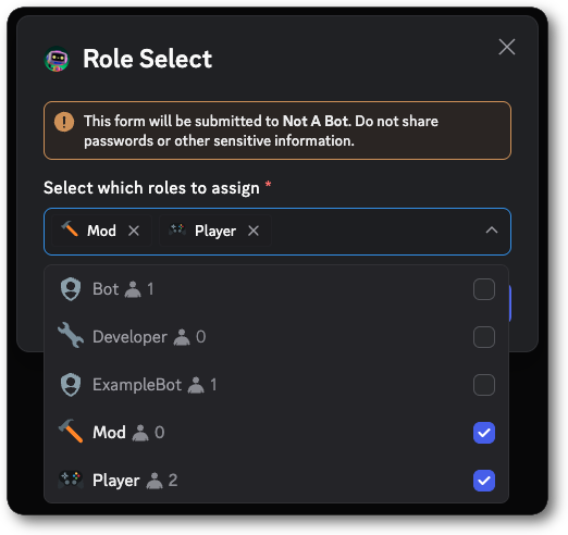 ```jsonc theme={"system"}
{
"type": 9,
"data": {
"custom_id": "role_modal",
"title": "Role Select",
"components": [
{
"type": 18,
"label": "Select which roles to assign",
"component": {
"type": 6,
"custom_id": "roles_selected",
"max_values": 10,
"required": true
}
}
]
}
}
```
When a user submits a modal that contains a Role Select, this is the basic form of the interaction data payload you will receive. The full payload
is available in the [interaction](/developers/interactions/receiving-and-responding#interaction-object-interaction-structure) reference.
```jsonc theme={"system"}
{
"type": 5, // InteractionType.MODAL_SUBMIT
...additionalInteractionFields, // See the Interaction documentation for all fields
"data": {
"custom_id": "role_modal",
"components": [
{
"component": {
"custom_id": "roles_selected",
"id": 2,
"type": 6,
"values": [
"1362213912946147499",
"1357409927680889032"
]
},
"id": 1,
"type": 18
}
],
"resolved": {
"roles": {
"1357409927680889032": {
"color": 7419530,
"colors": {
"primary_color": 7419530,
"secondary_color": null,
"tertiary_color": null
},
"description": null,
"flags": 0,
"hoist": true,
"icon": null,
"id": "1357409927680889032",
"managed": false,
"mentionable": true,
"name": "Player",
"permissions": "2249596494938111",
"position": 3,
"unicode_emoji": "🎮"
},
"1362213912946147499": {
"color": 11342935,
"colors": {
"primary_color": 11342935,
"secondary_color": null,
"tertiary_color": null
},
"description": null,
"flags": 0,
"hoist": false,
"icon": null,
"id": "1362213912946147499",
"managed": false,
"mentionable": false,
"name": "Mod",
"permissions": "0",
"position": 1,
"unicode_emoji": "🔨"
}
}
}
}
}
```
***
## Mentionable Select
A Mentionable Select is an interactive component that allows users to select one or more mentionables in a message or modal. Options are automatically populated based on available mentionables in the server.
Mentionable Selects can be configured for both single-select and multi-select behavior. When a user finishes making their choice(s), your app receives an [interaction](/developers/interactions/receiving-and-responding#interaction-object-interaction-structure).
Mentionable Selects are available in messages and modals. They must be placed inside an [Action Row](/developers/components/reference#action-row) in messages and a [Label](/developers/components/reference#label) in modals.
###### Mentionable Select Structure
| Field | Type | Description |
| ---------------- | ------------------------------------------------------------------------------------------------------------- | -------------------------------------------------------------------------------------------------------------------------------------------------------- |
| type | integer | `7` for mentionable select |
| id? | integer | Optional identifier for component |
| custom\_id | string | ID for the select menu; 1-100 characters |
| placeholder? | string | Placeholder text if nothing is selected; max 150 characters |
| default\_values? | array of [default value objects](/developers/components/reference#user-select-select-default-value-structure) | List of default values for auto-populated select menu components; number of default values must be in the range defined by `min_values` and `max_values` |
| min\_values?\* | integer | Minimum number of items that must be chosen (defaults to 1); min 0 (see note), max 25 |
| max\_values? | integer | Maximum number of items that can be chosen (defaults to 1); max 25 |
| required?\*\* | boolean | Whether the mentionable select is required to answer in a modal (defaults to `true`) |
| disabled?\*\*\* | boolean | Whether select menu is disabled in a message (defaults to `false`) |
\* `min_values` must be either omitted or at least `1` if `required` is omitted or `true`.
\*\* The `required` field is only available for Mentionable Selects in modals. It is ignored in messages.
\*\*\* Using `disabled` in a modal will result in an error. Modals can not currently have disabled components in them.
###### Mentionable Select Interaction Response Structure
| Field | Type | Description |
| ----------------- | ------------------------------------------------------------------------------------------------------------- | ------------------------------------------------------------ |
| type\* | integer | `7` for a Mentionable Select |
| component\_type\* | integer | `7` for a Mentionable Select |
| id | integer | Unique identifier for the component |
| custom\_id | string | Developer-defined identifier for the input; 1-100 characters |
| resolved | [resolved data](/developers/interactions/receiving-and-responding#interaction-object-resolved-data-structure) | Resolved entities from selected options |
| values | array of snowflakes | IDs of the selected mentionables |
\* In message interaction responses `component_type` will be returned and in modal interaction responses `type` will be returned.
###### Examples
```jsonc theme={"system"}
{
"type": 9,
"data": {
"custom_id": "role_modal",
"title": "Role Select",
"components": [
{
"type": 18,
"label": "Select which roles to assign",
"component": {
"type": 6,
"custom_id": "roles_selected",
"max_values": 10,
"required": true
}
}
]
}
}
```
When a user submits a modal that contains a Role Select, this is the basic form of the interaction data payload you will receive. The full payload
is available in the [interaction](/developers/interactions/receiving-and-responding#interaction-object-interaction-structure) reference.
```jsonc theme={"system"}
{
"type": 5, // InteractionType.MODAL_SUBMIT
...additionalInteractionFields, // See the Interaction documentation for all fields
"data": {
"custom_id": "role_modal",
"components": [
{
"component": {
"custom_id": "roles_selected",
"id": 2,
"type": 6,
"values": [
"1362213912946147499",
"1357409927680889032"
]
},
"id": 1,
"type": 18
}
],
"resolved": {
"roles": {
"1357409927680889032": {
"color": 7419530,
"colors": {
"primary_color": 7419530,
"secondary_color": null,
"tertiary_color": null
},
"description": null,
"flags": 0,
"hoist": true,
"icon": null,
"id": "1357409927680889032",
"managed": false,
"mentionable": true,
"name": "Player",
"permissions": "2249596494938111",
"position": 3,
"unicode_emoji": "🎮"
},
"1362213912946147499": {
"color": 11342935,
"colors": {
"primary_color": 11342935,
"secondary_color": null,
"tertiary_color": null
},
"description": null,
"flags": 0,
"hoist": false,
"icon": null,
"id": "1362213912946147499",
"managed": false,
"mentionable": false,
"name": "Mod",
"permissions": "0",
"position": 1,
"unicode_emoji": "🔨"
}
}
}
}
}
```
***
## Mentionable Select
A Mentionable Select is an interactive component that allows users to select one or more mentionables in a message or modal. Options are automatically populated based on available mentionables in the server.
Mentionable Selects can be configured for both single-select and multi-select behavior. When a user finishes making their choice(s), your app receives an [interaction](/developers/interactions/receiving-and-responding#interaction-object-interaction-structure).
Mentionable Selects are available in messages and modals. They must be placed inside an [Action Row](/developers/components/reference#action-row) in messages and a [Label](/developers/components/reference#label) in modals.
###### Mentionable Select Structure
| Field | Type | Description |
| ---------------- | ------------------------------------------------------------------------------------------------------------- | -------------------------------------------------------------------------------------------------------------------------------------------------------- |
| type | integer | `7` for mentionable select |
| id? | integer | Optional identifier for component |
| custom\_id | string | ID for the select menu; 1-100 characters |
| placeholder? | string | Placeholder text if nothing is selected; max 150 characters |
| default\_values? | array of [default value objects](/developers/components/reference#user-select-select-default-value-structure) | List of default values for auto-populated select menu components; number of default values must be in the range defined by `min_values` and `max_values` |
| min\_values?\* | integer | Minimum number of items that must be chosen (defaults to 1); min 0 (see note), max 25 |
| max\_values? | integer | Maximum number of items that can be chosen (defaults to 1); max 25 |
| required?\*\* | boolean | Whether the mentionable select is required to answer in a modal (defaults to `true`) |
| disabled?\*\*\* | boolean | Whether select menu is disabled in a message (defaults to `false`) |
\* `min_values` must be either omitted or at least `1` if `required` is omitted or `true`.
\*\* The `required` field is only available for Mentionable Selects in modals. It is ignored in messages.
\*\*\* Using `disabled` in a modal will result in an error. Modals can not currently have disabled components in them.
###### Mentionable Select Interaction Response Structure
| Field | Type | Description |
| ----------------- | ------------------------------------------------------------------------------------------------------------- | ------------------------------------------------------------ |
| type\* | integer | `7` for a Mentionable Select |
| component\_type\* | integer | `7` for a Mentionable Select |
| id | integer | Unique identifier for the component |
| custom\_id | string | Developer-defined identifier for the input; 1-100 characters |
| resolved | [resolved data](/developers/interactions/receiving-and-responding#interaction-object-resolved-data-structure) | Resolved entities from selected options |
| values | array of snowflakes | IDs of the selected mentionables |
\* In message interaction responses `component_type` will be returned and in modal interaction responses `type` will be returned.
###### Examples
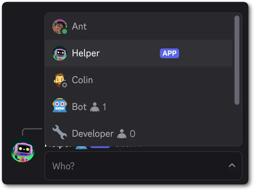 ```jsonc theme={"system"}
{
"flags": 32768,
"components": [
{
"type": 1, // ComponentType.ACTION_ROW
"components": [
{
"type": 7, // ComponentType.MENTIONABLE_SELECT
"custom_id": "who_to_ping",
"placeholder": "Who?",
}
]
}
]
}
```
When a user interacts with a Mentionable Select in a message, this is the basic form of the interaction data payload you will receive. The full payload
is available in the [interaction](/developers/interactions/receiving-and-responding#interaction-object-interaction-structure) reference.
`members` and `users` may both be present in the `resolved` object when a user is selected.
```jsonc theme={"system"}
{
"type": 3, // InteractionType.MESSAGE_COMPONENT
...additionalInteractionFields, // See the Interaction documentation for all fields
"data": {
"component_type": 7, // ComponentType.MENTIONABLE_SELECT
"id": 2,
"custom_id": "who_to_ping",
"values": [
"111111111111111111",
"222222222222222222",
],
"resolved": {
"members": {
"1111111111111111111": {
"avatar": null,
"banner": null,
"collectibles": null,
"communication_disabled_until": null,
"flags": 0,
"joined_at": "2025-05-16T22:51:16.692000+00:00",
"nick": null,
"pending": false,
"permissions": "2248473465835073",
"premium_since": null,
"roles": [
"2222222222222222222"
],
"unusual_dm_activity_until": null
}
},
"users": {
"1111111111111111111": {
"avatar": "d54e87d20539fe9aad2f2cebe56809a2",
"avatar_decoration_data": null,
"bot": true,
"clan": null,
"collectibles": null,
"discriminator": "9062",
"display_name_styles": null,
"global_name": null,
"id": "1111111111111111111",
"primary_guild": null,
"public_flags": 524289,
"username": "ExampleBot"
}
},
"roles": {
"222222222222222222": {
"color": 12745742,
"colors": {
"primary_color": 12745742,
"secondary_color": null,
"tertiary_color": null
},
"description": null,
"flags": 0,
"hoist": false,
"icon": null,
"id": "222222222222222222",
"managed": false,
"mentionable": true,
"name": "Developer",
"permissions": "0",
"position": 2,
"unicode_emoji": "🔧"
}
}
}
},
}
```
```jsonc theme={"system"}
{
"flags": 32768,
"components": [
{
"type": 1, // ComponentType.ACTION_ROW
"components": [
{
"type": 7, // ComponentType.MENTIONABLE_SELECT
"custom_id": "who_to_ping",
"placeholder": "Who?",
}
]
}
]
}
```
When a user interacts with a Mentionable Select in a message, this is the basic form of the interaction data payload you will receive. The full payload
is available in the [interaction](/developers/interactions/receiving-and-responding#interaction-object-interaction-structure) reference.
`members` and `users` may both be present in the `resolved` object when a user is selected.
```jsonc theme={"system"}
{
"type": 3, // InteractionType.MESSAGE_COMPONENT
...additionalInteractionFields, // See the Interaction documentation for all fields
"data": {
"component_type": 7, // ComponentType.MENTIONABLE_SELECT
"id": 2,
"custom_id": "who_to_ping",
"values": [
"111111111111111111",
"222222222222222222",
],
"resolved": {
"members": {
"1111111111111111111": {
"avatar": null,
"banner": null,
"collectibles": null,
"communication_disabled_until": null,
"flags": 0,
"joined_at": "2025-05-16T22:51:16.692000+00:00",
"nick": null,
"pending": false,
"permissions": "2248473465835073",
"premium_since": null,
"roles": [
"2222222222222222222"
],
"unusual_dm_activity_until": null
}
},
"users": {
"1111111111111111111": {
"avatar": "d54e87d20539fe9aad2f2cebe56809a2",
"avatar_decoration_data": null,
"bot": true,
"clan": null,
"collectibles": null,
"discriminator": "9062",
"display_name_styles": null,
"global_name": null,
"id": "1111111111111111111",
"primary_guild": null,
"public_flags": 524289,
"username": "ExampleBot"
}
},
"roles": {
"222222222222222222": {
"color": 12745742,
"colors": {
"primary_color": 12745742,
"secondary_color": null,
"tertiary_color": null
},
"description": null,
"flags": 0,
"hoist": false,
"icon": null,
"id": "222222222222222222",
"managed": false,
"mentionable": true,
"name": "Developer",
"permissions": "0",
"position": 2,
"unicode_emoji": "🔧"
}
}
}
},
}
```
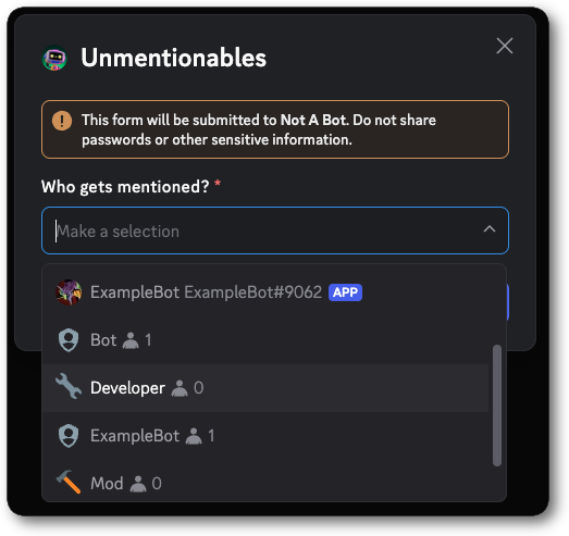 ```jsonc theme={"system"}
{
"type": 9,
"data": {
"custom_id": "mentionable_modal",
"title": "Unmentionables",
"components": [
{
"type": 18,
"label": "Who gets mentioned?",
"component": {
"type": 7,
"custom_id": "mentionables_selected",
"required": true
}
}
]
}
}
```
When a user submits a modal that contains a Mentionable Select, this is the basic form of the interaction data payload you will receive. The full payload
is available in the [interaction](/developers/interactions/receiving-and-responding#interaction-object-interaction-structure) reference.
```jsonc theme={"system"}
{
"type": 5, // InteractionType.MODAL_SUBMIT
...additionalInteractionFields, // See the Interaction documentation for all fields
"data": {
"custom_id": "mentionable_modal",
"components": [
{
"component": {
"custom_id": "mentionables_selected",
"id": 2,
"type": 7,
"values": [
"1361539726405926952"
]
},
"id": 1,
"type": 18
}
],
"resolved": {
"roles": {
"1361539726405926952": {
"color": 12745742,
"colors": {
"primary_color": 12745742,
"secondary_color": null,
"tertiary_color": null
},
"description": null,
"flags": 0,
"hoist": false,
"icon": null,
"id": "1361539726405926952",
"managed": false,
"mentionable": true,
"name": "Developer",
"permissions": "0",
"position": 2,
"unicode_emoji": "🔧"
}
}
}
}
}
```
***
## Channel Select
A Channel Select is an interactive component that allows users to select one or more channels in a message or modal. Options are automatically populated based on available channels in the server and can be filtered by channel types.
Channel Selects can be configured for both single-select and multi-select behavior. When a user finishes making their choice(s) your app receives an [interaction](/developers/interactions/receiving-and-responding#interaction-object-interaction-structure).
Channel Selects are available in messages and modals. They must be placed inside an [Action Row](/developers/components/reference#action-row) in messages and a [Label](/developers/components/reference#label) in modals.
###### Channel Select Structure
| Field | Type | Description |
| ---------------- | ------------------------------------------------------------------------------------------------------------- | -------------------------------------------------------------------------------------------------------------------------------------------------------- |
| type | integer | `8` for channel select |
| id? | integer | Optional identifier for component |
| custom\_id | string | ID for the select menu; 1-100 characters |
| channel\_types? | array of [channel types](/developers/resources/channel#channel-object-channel-types) | List of channel types to include in the channel select component |
| placeholder? | string | Placeholder text if nothing is selected; max 150 characters |
| default\_values? | array of [default value objects](/developers/components/reference#user-select-select-default-value-structure) | List of default values for auto-populated select menu components; number of default values must be in the range defined by `min_values` and `max_values` |
| min\_values?\* | integer | Minimum number of items that must be chosen (defaults to 1); min 0 (see note), max 25 |
| max\_values? | integer | Maximum number of items that can be chosen (defaults to 1); max 25 |
| required?\*\* | boolean | Whether the channel select is required to answer in a modal (defaults to `true`) |
| disabled?\*\*\* | boolean | Whether select menu is disabled in a message (defaults to `false`) |
\* `min_values` must be either omitted or at least `1` if `required` is omitted or `true`.
\*\* The `required` field is only available for Channel Selects in modals. It is ignored in messages.
\*\*\* Using `disabled` in a modal will result in an error. Modals can not currently have disabled components in them.
###### Channel Select Interaction Response Structure
| Field | Type | Description |
| ----------------- | ------------------------------------------------------------------------------------------------------------- | ------------------------------------------------------------ |
| type\* | integer | `8` for a Channel Select |
| component\_type\* | integer | `8` for a Channel Select |
| id | integer | Unique identifier for the component |
| custom\_id | string | Developer-defined identifier for the input; 1-100 characters |
| resolved | [resolved data](/developers/interactions/receiving-and-responding#interaction-object-resolved-data-structure) | Resolved entities from selected options |
| values | array of snowflakes | IDs of the selected channels |
\* In message interaction responses `component_type` will be returned and in modal interaction responses `type` will be returned.
###### Examples
```jsonc theme={"system"}
{
"type": 9,
"data": {
"custom_id": "mentionable_modal",
"title": "Unmentionables",
"components": [
{
"type": 18,
"label": "Who gets mentioned?",
"component": {
"type": 7,
"custom_id": "mentionables_selected",
"required": true
}
}
]
}
}
```
When a user submits a modal that contains a Mentionable Select, this is the basic form of the interaction data payload you will receive. The full payload
is available in the [interaction](/developers/interactions/receiving-and-responding#interaction-object-interaction-structure) reference.
```jsonc theme={"system"}
{
"type": 5, // InteractionType.MODAL_SUBMIT
...additionalInteractionFields, // See the Interaction documentation for all fields
"data": {
"custom_id": "mentionable_modal",
"components": [
{
"component": {
"custom_id": "mentionables_selected",
"id": 2,
"type": 7,
"values": [
"1361539726405926952"
]
},
"id": 1,
"type": 18
}
],
"resolved": {
"roles": {
"1361539726405926952": {
"color": 12745742,
"colors": {
"primary_color": 12745742,
"secondary_color": null,
"tertiary_color": null
},
"description": null,
"flags": 0,
"hoist": false,
"icon": null,
"id": "1361539726405926952",
"managed": false,
"mentionable": true,
"name": "Developer",
"permissions": "0",
"position": 2,
"unicode_emoji": "🔧"
}
}
}
}
}
```
***
## Channel Select
A Channel Select is an interactive component that allows users to select one or more channels in a message or modal. Options are automatically populated based on available channels in the server and can be filtered by channel types.
Channel Selects can be configured for both single-select and multi-select behavior. When a user finishes making their choice(s) your app receives an [interaction](/developers/interactions/receiving-and-responding#interaction-object-interaction-structure).
Channel Selects are available in messages and modals. They must be placed inside an [Action Row](/developers/components/reference#action-row) in messages and a [Label](/developers/components/reference#label) in modals.
###### Channel Select Structure
| Field | Type | Description |
| ---------------- | ------------------------------------------------------------------------------------------------------------- | -------------------------------------------------------------------------------------------------------------------------------------------------------- |
| type | integer | `8` for channel select |
| id? | integer | Optional identifier for component |
| custom\_id | string | ID for the select menu; 1-100 characters |
| channel\_types? | array of [channel types](/developers/resources/channel#channel-object-channel-types) | List of channel types to include in the channel select component |
| placeholder? | string | Placeholder text if nothing is selected; max 150 characters |
| default\_values? | array of [default value objects](/developers/components/reference#user-select-select-default-value-structure) | List of default values for auto-populated select menu components; number of default values must be in the range defined by `min_values` and `max_values` |
| min\_values?\* | integer | Minimum number of items that must be chosen (defaults to 1); min 0 (see note), max 25 |
| max\_values? | integer | Maximum number of items that can be chosen (defaults to 1); max 25 |
| required?\*\* | boolean | Whether the channel select is required to answer in a modal (defaults to `true`) |
| disabled?\*\*\* | boolean | Whether select menu is disabled in a message (defaults to `false`) |
\* `min_values` must be either omitted or at least `1` if `required` is omitted or `true`.
\*\* The `required` field is only available for Channel Selects in modals. It is ignored in messages.
\*\*\* Using `disabled` in a modal will result in an error. Modals can not currently have disabled components in them.
###### Channel Select Interaction Response Structure
| Field | Type | Description |
| ----------------- | ------------------------------------------------------------------------------------------------------------- | ------------------------------------------------------------ |
| type\* | integer | `8` for a Channel Select |
| component\_type\* | integer | `8` for a Channel Select |
| id | integer | Unique identifier for the component |
| custom\_id | string | Developer-defined identifier for the input; 1-100 characters |
| resolved | [resolved data](/developers/interactions/receiving-and-responding#interaction-object-resolved-data-structure) | Resolved entities from selected options |
| values | array of snowflakes | IDs of the selected channels |
\* In message interaction responses `component_type` will be returned and in modal interaction responses `type` will be returned.
###### Examples
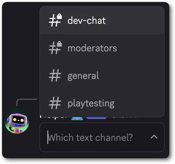 ```jsonc theme={"system"}
{
"flags": 32768,
"components": [
{
"type": 1, // ComponentType.ACTION_ROW
"components": [
{
"type": 8, // ComponentType.CHANNEL_SELECT
"custom_id": "notification_channel",
"channel_types": [0], // ChannelType.TEXT
"placeholder": "Which text channel?"
}
]
}
]
}
```
When a user interacts with a Channel Select in a message, this is the basic form of the interaction data payload you will receive. The full payload
is available in the [interaction](/developers/interactions/receiving-and-responding#interaction-object-interaction-structure) reference.
```jsonc theme={"system"}
{
"type": 3, // InteractionType.MESSAGE_COMPONENT
...additionalInteractionFields, // See the Interaction documentation for all fields
"data": {
"component_type": 8, // ComponentType.CHANNEL_SELECT
"id": 2,
"custom_id": "notification_channel",
"values": [
"333333333333333333",
],
"resolved": {
"channels": {
"333333333333333333": {
"flags": 0,
"guild_id": "44444444444444444",
"id": "333333333333333333",
"last_message_id": null,
"name": "playtesting",
"nsfw": false,
"parent_id": "5555555555555555",
"permissions": "4503599627370495",
"position": 1,
"rate_limit_per_user": 0,
"topic": null,
"type": 0 // ChannelType.TEXT
}
}
}
},
}
```
```jsonc theme={"system"}
{
"flags": 32768,
"components": [
{
"type": 1, // ComponentType.ACTION_ROW
"components": [
{
"type": 8, // ComponentType.CHANNEL_SELECT
"custom_id": "notification_channel",
"channel_types": [0], // ChannelType.TEXT
"placeholder": "Which text channel?"
}
]
}
]
}
```
When a user interacts with a Channel Select in a message, this is the basic form of the interaction data payload you will receive. The full payload
is available in the [interaction](/developers/interactions/receiving-and-responding#interaction-object-interaction-structure) reference.
```jsonc theme={"system"}
{
"type": 3, // InteractionType.MESSAGE_COMPONENT
...additionalInteractionFields, // See the Interaction documentation for all fields
"data": {
"component_type": 8, // ComponentType.CHANNEL_SELECT
"id": 2,
"custom_id": "notification_channel",
"values": [
"333333333333333333",
],
"resolved": {
"channels": {
"333333333333333333": {
"flags": 0,
"guild_id": "44444444444444444",
"id": "333333333333333333",
"last_message_id": null,
"name": "playtesting",
"nsfw": false,
"parent_id": "5555555555555555",
"permissions": "4503599627370495",
"position": 1,
"rate_limit_per_user": 0,
"topic": null,
"type": 0 // ChannelType.TEXT
}
}
}
},
}
```
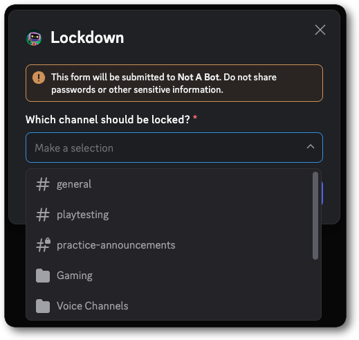 ```jsonc theme={"system"}
{
"type": 9,
"data": {
"custom_id": "channel_modal",
"title": "Lockdown",
"components": [
{
"type": 18,
"label": "Which channel should be locked?",
"component": {
"type": 8,
"custom_id": "channel_selected",
"required": true
}
}
]
}
}
```
When a user submits a modal that contains a Channel Select, this is the basic form of the interaction data payload you will receive. The full payload
is available in the [interaction](/developers/interactions/receiving-and-responding#interaction-object-interaction-structure) reference.
```jsonc theme={"system"}
{
"type": 5, // InteractionType.MODAL_SUBMIT
...additionalInteractionFields, // See the Interaction documentation for all fields
"data": {
"custom_id": "channel_modal",
"components": [
{
"component": {
"custom_id": "channel_selected",
"id": 2,
"type": 8,
"values": [
"1357483683627663450"
]
},
"id": 1,
"type": 18
}
],
"resolved": {
"channels": {
"1357483683627663450": {
"flags": 0,
"guild_id": "1111111111111111",
"id": "1357483683627663450",
"last_message_id": null,
"name": "playtesting",
"nsfw": false,
"parent_id": "1357129309164404938",
"permissions": "4503599627370495",
"position": 1,
"rate_limit_per_user": 0,
"topic": null,
"type": 0
}
}
}
}
}
```
***
## Section
A Section is a top-level layout component that allows you to contextually associate content with an accessory component.
The typical use-case is to contextually associate [text content](/developers/components/reference#text-display) with
an [accessory](/developers/components/reference#section-section-accessory-components).
Sections are currently only available in messages.
To use this component in messages you must send the [message flag](/developers/resources/message#message-object-message-flags) `1 << 15` (IS\_COMPONENTS\_V2) which can be activated on a per-message basis.
###### Section Structure
| Field | Type | Description |
| ---------- | ------------------------------------------------------------------------------------------------------ | ---------------------------------------------------------------------------------------------------------------------- |
| type | integer | `9` for section component |
| id? | integer | Optional identifier for component |
| components | array of [section child components](/developers/components/reference#section-section-child-components) | One to three child components representing the content of the section that is contextually associated to the accessory |
| accessory | [section accessory component](/developers/components/reference#section-section-accessory-components) | A component that is contextually associated to the content of the section |
Don't hardcode `components` to contain only text components. We may add other components in the future. Similarly, `accessory` may be expanded to include other components in the future.
###### Section Child Components
| Available Components |
| ------------------------------------------------------------- |
| [Text Display](/developers/components/reference#text-display) |
###### Section Accessory Components
| Available Components |
| ------------------------------------------------------- |
| [Button](/developers/components/reference#button) |
| [Thumbnail](/developers/components/reference#thumbnail) |
###### Examples
```jsonc theme={"system"}
{
"type": 9,
"data": {
"custom_id": "channel_modal",
"title": "Lockdown",
"components": [
{
"type": 18,
"label": "Which channel should be locked?",
"component": {
"type": 8,
"custom_id": "channel_selected",
"required": true
}
}
]
}
}
```
When a user submits a modal that contains a Channel Select, this is the basic form of the interaction data payload you will receive. The full payload
is available in the [interaction](/developers/interactions/receiving-and-responding#interaction-object-interaction-structure) reference.
```jsonc theme={"system"}
{
"type": 5, // InteractionType.MODAL_SUBMIT
...additionalInteractionFields, // See the Interaction documentation for all fields
"data": {
"custom_id": "channel_modal",
"components": [
{
"component": {
"custom_id": "channel_selected",
"id": 2,
"type": 8,
"values": [
"1357483683627663450"
]
},
"id": 1,
"type": 18
}
],
"resolved": {
"channels": {
"1357483683627663450": {
"flags": 0,
"guild_id": "1111111111111111",
"id": "1357483683627663450",
"last_message_id": null,
"name": "playtesting",
"nsfw": false,
"parent_id": "1357129309164404938",
"permissions": "4503599627370495",
"position": 1,
"rate_limit_per_user": 0,
"topic": null,
"type": 0
}
}
}
}
}
```
***
## Section
A Section is a top-level layout component that allows you to contextually associate content with an accessory component.
The typical use-case is to contextually associate [text content](/developers/components/reference#text-display) with
an [accessory](/developers/components/reference#section-section-accessory-components).
Sections are currently only available in messages.
To use this component in messages you must send the [message flag](/developers/resources/message#message-object-message-flags) `1 << 15` (IS\_COMPONENTS\_V2) which can be activated on a per-message basis.
###### Section Structure
| Field | Type | Description |
| ---------- | ------------------------------------------------------------------------------------------------------ | ---------------------------------------------------------------------------------------------------------------------- |
| type | integer | `9` for section component |
| id? | integer | Optional identifier for component |
| components | array of [section child components](/developers/components/reference#section-section-child-components) | One to three child components representing the content of the section that is contextually associated to the accessory |
| accessory | [section accessory component](/developers/components/reference#section-section-accessory-components) | A component that is contextually associated to the content of the section |
Don't hardcode `components` to contain only text components. We may add other components in the future. Similarly, `accessory` may be expanded to include other components in the future.
###### Section Child Components
| Available Components |
| ------------------------------------------------------------- |
| [Text Display](/developers/components/reference#text-display) |
###### Section Accessory Components
| Available Components |
| ------------------------------------------------------- |
| [Button](/developers/components/reference#button) |
| [Thumbnail](/developers/components/reference#thumbnail) |
###### Examples
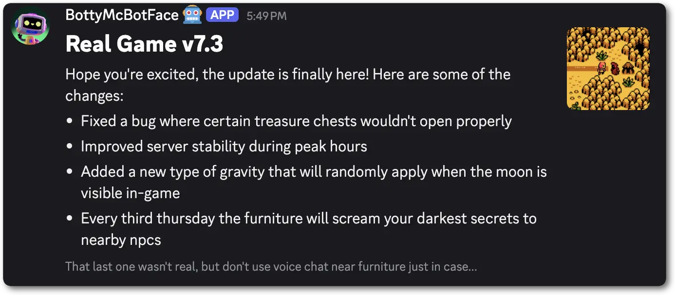 ```jsonc theme={"system"}
{
"flags": 32768,
"components": [
{
"type": 9, // ComponentType.SECTION
"components": [
{
"type": 10, // ComponentType.TEXT_DISPLAY
"content": "# Real Game v7.3"
},
{
"type": 10, // ComponentType.TEXT_DISPLAY
"content": "Hope you're excited, the update is finally here! Here are some of the changes:\n- Fixed a bug where certain treasure chests wouldn't open properly\n- Improved server stability during peak hours\n- Added a new type of gravity that will randomly apply when the moon is visible in-game\n- Every third thursday the furniture will scream your darkest secrets to nearby npcs"
},
{
"type": 10, // ComponentType.TEXT_DISPLAY
"content": "-# That last one wasn't real, but don't use voice chat near furniture just in case..."
}
],
"accessory": {
"type": 11, // ComponentType.THUMBNAIL
"media": {
"url": "https://websitewithopensourceimages/gamepreview.webp"
}
}
}
]
}
```
***
## Text Display
A Text Display is a content component that allows you to add markdown formatted text, including mentions (users, roles, etc) and emojis.
The behavior of this component is extremely similar to the [`content` field of a message](/developers/resources/message#message-object), but allows you to add multiple text components, controlling the layout of your message.
When sent in a message, pingable mentions (@user, @role, etc) present in this component will ping and send notifications based on the
value of the [allowed mention object](/developers/resources/message#allowed-mentions-object) set in [`message.allowed_mentions`](/developers/resources/message#message-object).
To use this component in messages you must send the [message flag](/developers/resources/message#message-object-message-flags) `1 << 15` (IS\_COMPONENTS\_V2) which can be activated on a per-message basis.
###### Text Display Structure
| Field | Type | Description |
| ------- | ------- | ------------------------------------------------ |
| type | integer | `10` for text display |
| id? | integer | Optional identifier for component |
| content | string | Text that will be displayed similar to a message |
###### Text Display Interaction Response Structure
| Field | Type | Description |
| ----- | ------- | ----------------------------------- |
| type | integer | `10` for a Text Display |
| id | integer | Unique identifier for the component |
###### Examples
```jsonc theme={"system"}
{
"flags": 32768,
"components": [
{
"type": 9, // ComponentType.SECTION
"components": [
{
"type": 10, // ComponentType.TEXT_DISPLAY
"content": "# Real Game v7.3"
},
{
"type": 10, // ComponentType.TEXT_DISPLAY
"content": "Hope you're excited, the update is finally here! Here are some of the changes:\n- Fixed a bug where certain treasure chests wouldn't open properly\n- Improved server stability during peak hours\n- Added a new type of gravity that will randomly apply when the moon is visible in-game\n- Every third thursday the furniture will scream your darkest secrets to nearby npcs"
},
{
"type": 10, // ComponentType.TEXT_DISPLAY
"content": "-# That last one wasn't real, but don't use voice chat near furniture just in case..."
}
],
"accessory": {
"type": 11, // ComponentType.THUMBNAIL
"media": {
"url": "https://websitewithopensourceimages/gamepreview.webp"
}
}
}
]
}
```
***
## Text Display
A Text Display is a content component that allows you to add markdown formatted text, including mentions (users, roles, etc) and emojis.
The behavior of this component is extremely similar to the [`content` field of a message](/developers/resources/message#message-object), but allows you to add multiple text components, controlling the layout of your message.
When sent in a message, pingable mentions (@user, @role, etc) present in this component will ping and send notifications based on the
value of the [allowed mention object](/developers/resources/message#allowed-mentions-object) set in [`message.allowed_mentions`](/developers/resources/message#message-object).
To use this component in messages you must send the [message flag](/developers/resources/message#message-object-message-flags) `1 << 15` (IS\_COMPONENTS\_V2) which can be activated on a per-message basis.
###### Text Display Structure
| Field | Type | Description |
| ------- | ------- | ------------------------------------------------ |
| type | integer | `10` for text display |
| id? | integer | Optional identifier for component |
| content | string | Text that will be displayed similar to a message |
###### Text Display Interaction Response Structure
| Field | Type | Description |
| ----- | ------- | ----------------------------------- |
| type | integer | `10` for a Text Display |
| id | integer | Unique identifier for the component |
###### Examples
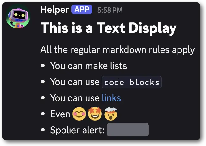 ```jsonc theme={"system"}
{
"flags": 32768,
"components": [
{
"type": 10, // ComponentType.TEXT_DISPLAY
"content": "# This is a Text Display\nAll the regular markdown rules apply\n- You can make lists\n- You can use `code blocks`\n- You can use [links](http://watchanimeattheoffice.com/)\n- Even :blush: :star_struck: :exploding_head:\n- Spoiler alert: ||these too!||"
}
]
}
```
```jsonc theme={"system"}
{
"flags": 32768,
"components": [
{
"type": 10, // ComponentType.TEXT_DISPLAY
"content": "# This is a Text Display\nAll the regular markdown rules apply\n- You can make lists\n- You can use `code blocks`\n- You can use [links](http://watchanimeattheoffice.com/)\n- Even :blush: :star_struck: :exploding_head:\n- Spoiler alert: ||these too!||"
}
]
}
```
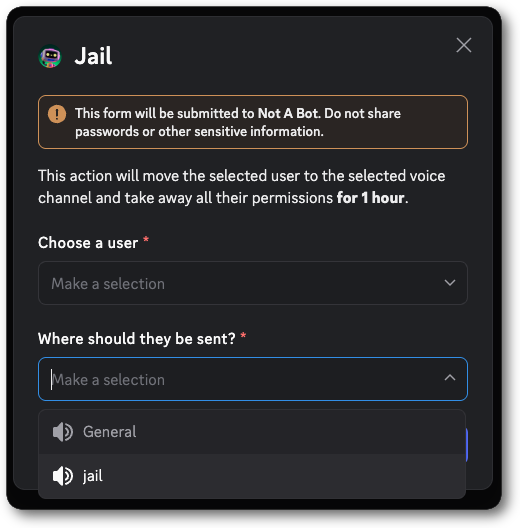 ```jsonc theme={"system"}
{
"type": 9,
"data": {
"custom_id": "jail_modal",
"title": "Jail",
"components": [
{
"type": 10,
"content": "This action will move the selected user to the selected voice channel and take away all their permissions **for 1 hour**."
},
{
"type": 18,
"label": "Choose a user",
"component": {
"type": 5,
"custom_id": "user_selected",
"required": true
}
},
{
"type": 18,
"label": "Where should they be sent?",
"component": {
"type": 8,
"custom_id": "channel_selected",
"channel_types": [
2
],
"required": true
}
}
]
}
}
```
***
## Thumbnail
A Thumbnail is a content component that displays visual media in a small form-factor. It is intended as an accessory for
to other content, and is primarily usable with [sections](/developers/components/reference#section). The media displayed is
defined by the [unfurled media item](/developers/components/reference#unfurled-media-item) structure, which supports
both uploaded media and externally hosted media.
Thumbnails are currently only available in messages as an accessory in a [section](/developers/components/reference#section).
Thumbnails currently only support images, including animated formats like GIF and WEBP. Videos are not supported at this time.
To use this component, you need to send the [message flag](/developers/resources/message#message-object-message-flags) `1 << 15` (IS\_COMPONENTS\_V2), which can be activated on a per-message basis.
###### Thumbnail Structure
| Field | Type | Description |
| ------------ | --------------------------------------------------------------------------- | -------------------------------------------------------------------------------------------------------------- |
| type | integer | `11` for thumbnail component |
| id? | integer | Optional identifier for component |
| media | [unfurled media item](/developers/components/reference#unfurled-media-item) | A url or attachment provided as an [unfurled media item](/developers/components/reference#unfurled-media-item) |
| description? | ?string | Alt text for the media, max 1024 characters |
| spoiler? | boolean | Whether the thumbnail should be a spoiler (or blurred out). Defaults to `false` |
###### Examples
```jsonc theme={"system"}
{
"flags": 32768,
"components": [
{
"type": 9, // ComponentType.SECTION
"components": [
{
"type": 10, // ComponentType.TEXT_DISPLAY
"content": "# Real Game v7.3"
},
{
"type": 10, // ComponentType.TEXT_DISPLAY
"content": "Hope you're excited, the update is finally here! Here are some of the changes:\n- Fixed a bug where certain treasure chests wouldn't open properly\n- Improved server stability during peak hours\n- Added a new type of gravity that will randomly apply when the moon is visible in-game\n- Every third thursday the furniture will scream your darkest secrets to nearby npcs"
},
{
"type": 10, // ComponentType.TEXT_DISPLAY
"content": "-# That last one wasn't real, but don't use voice chat near furniture just in case..."
}
],
"accessory": {
"type": 11, // ComponentType.THUMBNAIL
"media": {
"url": "https://websitewithopensourceimages/gamepreview.webp"
}
}
}
]
}
```
***
## Media Gallery
A Media Gallery is a top-level content component that allows you to display 1-10 media attachments in an organized gallery format.
Each item can have optional descriptions and can be marked as spoilers.
Media Galleries are currently only available in messages.
To use this component in messages you must send the [message flag](/developers/resources/message#message-object-message-flags) `1 << 15` (IS\_COMPONENTS\_V2) which can be activated on a per-message basis.
###### Media Gallery Structure
| Field | Type | Description |
| ----- | ----------------------------------------------------------------------------------------------------------- | --------------------------------- |
| type | integer | `12` for media gallery component |
| id? | integer | Optional identifier for component |
| items | array of [media gallery items](/developers/components/reference#media-gallery-media-gallery-item-structure) | 1 to 10 media gallery items |
###### Media Gallery Item Structure
| Field | Type | Description |
| ------------ | --------------------------------------------------------------------------- | -------------------------------------------------------------------------------------------------------------- |
| media | [unfurled media item](/developers/components/reference#unfurled-media-item) | A url or attachment provided as an [unfurled media item](/developers/components/reference#unfurled-media-item) |
| description? | ?string | Alt text for the media, max 1024 characters |
| spoiler? | boolean | Whether the media should be a spoiler (or blurred out). Defaults to `false` |
###### Examples
```jsonc theme={"system"}
{
"type": 9,
"data": {
"custom_id": "jail_modal",
"title": "Jail",
"components": [
{
"type": 10,
"content": "This action will move the selected user to the selected voice channel and take away all their permissions **for 1 hour**."
},
{
"type": 18,
"label": "Choose a user",
"component": {
"type": 5,
"custom_id": "user_selected",
"required": true
}
},
{
"type": 18,
"label": "Where should they be sent?",
"component": {
"type": 8,
"custom_id": "channel_selected",
"channel_types": [
2
],
"required": true
}
}
]
}
}
```
***
## Thumbnail
A Thumbnail is a content component that displays visual media in a small form-factor. It is intended as an accessory for
to other content, and is primarily usable with [sections](/developers/components/reference#section). The media displayed is
defined by the [unfurled media item](/developers/components/reference#unfurled-media-item) structure, which supports
both uploaded media and externally hosted media.
Thumbnails are currently only available in messages as an accessory in a [section](/developers/components/reference#section).
Thumbnails currently only support images, including animated formats like GIF and WEBP. Videos are not supported at this time.
To use this component, you need to send the [message flag](/developers/resources/message#message-object-message-flags) `1 << 15` (IS\_COMPONENTS\_V2), which can be activated on a per-message basis.
###### Thumbnail Structure
| Field | Type | Description |
| ------------ | --------------------------------------------------------------------------- | -------------------------------------------------------------------------------------------------------------- |
| type | integer | `11` for thumbnail component |
| id? | integer | Optional identifier for component |
| media | [unfurled media item](/developers/components/reference#unfurled-media-item) | A url or attachment provided as an [unfurled media item](/developers/components/reference#unfurled-media-item) |
| description? | ?string | Alt text for the media, max 1024 characters |
| spoiler? | boolean | Whether the thumbnail should be a spoiler (or blurred out). Defaults to `false` |
###### Examples
```jsonc theme={"system"}
{
"flags": 32768,
"components": [
{
"type": 9, // ComponentType.SECTION
"components": [
{
"type": 10, // ComponentType.TEXT_DISPLAY
"content": "# Real Game v7.3"
},
{
"type": 10, // ComponentType.TEXT_DISPLAY
"content": "Hope you're excited, the update is finally here! Here are some of the changes:\n- Fixed a bug where certain treasure chests wouldn't open properly\n- Improved server stability during peak hours\n- Added a new type of gravity that will randomly apply when the moon is visible in-game\n- Every third thursday the furniture will scream your darkest secrets to nearby npcs"
},
{
"type": 10, // ComponentType.TEXT_DISPLAY
"content": "-# That last one wasn't real, but don't use voice chat near furniture just in case..."
}
],
"accessory": {
"type": 11, // ComponentType.THUMBNAIL
"media": {
"url": "https://websitewithopensourceimages/gamepreview.webp"
}
}
}
]
}
```
***
## Media Gallery
A Media Gallery is a top-level content component that allows you to display 1-10 media attachments in an organized gallery format.
Each item can have optional descriptions and can be marked as spoilers.
Media Galleries are currently only available in messages.
To use this component in messages you must send the [message flag](/developers/resources/message#message-object-message-flags) `1 << 15` (IS\_COMPONENTS\_V2) which can be activated on a per-message basis.
###### Media Gallery Structure
| Field | Type | Description |
| ----- | ----------------------------------------------------------------------------------------------------------- | --------------------------------- |
| type | integer | `12` for media gallery component |
| id? | integer | Optional identifier for component |
| items | array of [media gallery items](/developers/components/reference#media-gallery-media-gallery-item-structure) | 1 to 10 media gallery items |
###### Media Gallery Item Structure
| Field | Type | Description |
| ------------ | --------------------------------------------------------------------------- | -------------------------------------------------------------------------------------------------------------- |
| media | [unfurled media item](/developers/components/reference#unfurled-media-item) | A url or attachment provided as an [unfurled media item](/developers/components/reference#unfurled-media-item) |
| description? | ?string | Alt text for the media, max 1024 characters |
| spoiler? | boolean | Whether the media should be a spoiler (or blurred out). Defaults to `false` |
###### Examples
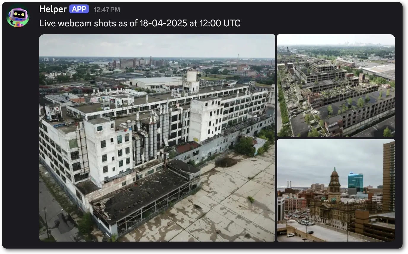 ```jsonc theme={"system"}
{
"flags": 32768,
"components": [
{
"type": 10, // ComponentType.TEXT_DISPLAY
"content": "Live webcam shots as of 18-04-2025 at 12:00 UTC"
},
{
"type": 12, // ComponentType.MEDIA_GALLERY
"items": [
{
"media": {"url": "https://livevideofeedconvertedtoimage/webcam1.webp"},
"description": "An aerial view looking down on older industrial complex buildings. The main building is white with many windows and pipes running up the walls."
},
{
"media": {"url": "https://livevideofeedconvertedtoimage/webcam2.webp"},
"description": "An aerial view of old broken buildings. Nature has begun to take root in the rooftops. A portion of the middle building's roof has collapsed inward. In the distant haze you can make out a far away city."
},
{
"media": {"url": "https://livevideofeedconvertedtoimage/webcam3.webp"},
"description": "A street view of a downtown city. Prominently in photo are skyscrapers and a domed building"
}
]
}
]
}
```
***
## File
A File is a top-level content component that allows you to display an [uploaded file](/developers/components/reference#uploading-a-file) as
an attachment to the message and reference it in the component. Each file component can only display 1 attached file, but you can upload
multiple files and add them to different file components within your payload.
Files are currently only available in messages.
The File component only supports using the `attachment://` protocol in [unfurled media item](/developers/components/reference#unfurled-media-item)
To use this component in messages you must send the [message flag](/developers/resources/message#message-object-message-flags) `1 << 15` (IS\_COMPONENTS\_V2) which can be activated on a per-message basis.
###### File Structure
| Field | Type | Description |
| -------- | --------------------------------------------------------------------------- | -------------------------------------------------------------------------------------------------------------------------------- |
| type | integer | `13` for a file component |
| id? | integer | Optional identifier for component |
| file | [unfurled media item](/developers/components/reference#unfurled-media-item) | This unfurled media item is unique in that it **only** supports attachment references using the `attachment://` syntax |
| spoiler? | boolean | Whether the media should be a spoiler (or blurred out). Defaults to `false` |
| name? | string | The name of the file. This field is ignored and provided by the API as part of the response |
| size? | integer | The size of the file in bytes. This field is ignored and provided by the API as part of the response |
###### Examples
```jsonc theme={"system"}
{
"flags": 32768,
"components": [
{
"type": 10, // ComponentType.TEXT_DISPLAY
"content": "Live webcam shots as of 18-04-2025 at 12:00 UTC"
},
{
"type": 12, // ComponentType.MEDIA_GALLERY
"items": [
{
"media": {"url": "https://livevideofeedconvertedtoimage/webcam1.webp"},
"description": "An aerial view looking down on older industrial complex buildings. The main building is white with many windows and pipes running up the walls."
},
{
"media": {"url": "https://livevideofeedconvertedtoimage/webcam2.webp"},
"description": "An aerial view of old broken buildings. Nature has begun to take root in the rooftops. A portion of the middle building's roof has collapsed inward. In the distant haze you can make out a far away city."
},
{
"media": {"url": "https://livevideofeedconvertedtoimage/webcam3.webp"},
"description": "A street view of a downtown city. Prominently in photo are skyscrapers and a domed building"
}
]
}
]
}
```
***
## File
A File is a top-level content component that allows you to display an [uploaded file](/developers/components/reference#uploading-a-file) as
an attachment to the message and reference it in the component. Each file component can only display 1 attached file, but you can upload
multiple files and add them to different file components within your payload.
Files are currently only available in messages.
The File component only supports using the `attachment://` protocol in [unfurled media item](/developers/components/reference#unfurled-media-item)
To use this component in messages you must send the [message flag](/developers/resources/message#message-object-message-flags) `1 << 15` (IS\_COMPONENTS\_V2) which can be activated on a per-message basis.
###### File Structure
| Field | Type | Description |
| -------- | --------------------------------------------------------------------------- | -------------------------------------------------------------------------------------------------------------------------------- |
| type | integer | `13` for a file component |
| id? | integer | Optional identifier for component |
| file | [unfurled media item](/developers/components/reference#unfurled-media-item) | This unfurled media item is unique in that it **only** supports attachment references using the `attachment://` syntax |
| spoiler? | boolean | Whether the media should be a spoiler (or blurred out). Defaults to `false` |
| name? | string | The name of the file. This field is ignored and provided by the API as part of the response |
| size? | integer | The size of the file in bytes. This field is ignored and provided by the API as part of the response |
###### Examples
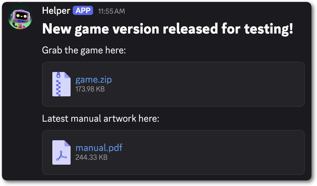 This example makes use of the `attachment://` protocol functionality in [unfurled media item](/developers/components/reference#unfurled-media-item).
```jsonc theme={"system"}
{
"flags": 32768,
"components": [
{
"type": 10, // ComponentType.TEXT_DISPLAY
"content": "# New game version released for testing!\nGrab the game here:"
},
{
"type": 13, // ComponentType.FILE
"file": {
"url": "attachment://game.zip"
}
},
{
"type": 10, // ComponentType.TEXT_DISPLAY
"content": "Latest manual artwork here:"
},
{
"type": 13, // ComponentType.FILE
"file": {
"url": "attachment://manual.pdf"
}
}
]
}
```
***
## Separator
A Separator is a top-level layout component that adds vertical padding and visual division between other components.
Separators are currently only available in messages.
To use this component in messages you must send the [message flag](/developers/resources/message#message-object-message-flags) `1 << 15` (IS\_COMPONENTS\_V2) which can be activated on a per-message basis.
###### Separator Structure
| Field | Type | Description |
| -------- | ------- | --------------------------------------------------------------------------------------- |
| type | integer | `14` for separator component |
| id? | integer | Optional identifier for component |
| divider? | boolean | Whether a visual divider should be displayed in the component. Defaults to `true` |
| spacing? | integer | Size of separator padding—`1` for small padding, `2` for large padding. Defaults to `1` |
###### Examples
This example makes use of the `attachment://` protocol functionality in [unfurled media item](/developers/components/reference#unfurled-media-item).
```jsonc theme={"system"}
{
"flags": 32768,
"components": [
{
"type": 10, // ComponentType.TEXT_DISPLAY
"content": "# New game version released for testing!\nGrab the game here:"
},
{
"type": 13, // ComponentType.FILE
"file": {
"url": "attachment://game.zip"
}
},
{
"type": 10, // ComponentType.TEXT_DISPLAY
"content": "Latest manual artwork here:"
},
{
"type": 13, // ComponentType.FILE
"file": {
"url": "attachment://manual.pdf"
}
}
]
}
```
***
## Separator
A Separator is a top-level layout component that adds vertical padding and visual division between other components.
Separators are currently only available in messages.
To use this component in messages you must send the [message flag](/developers/resources/message#message-object-message-flags) `1 << 15` (IS\_COMPONENTS\_V2) which can be activated on a per-message basis.
###### Separator Structure
| Field | Type | Description |
| -------- | ------- | --------------------------------------------------------------------------------------- |
| type | integer | `14` for separator component |
| id? | integer | Optional identifier for component |
| divider? | boolean | Whether a visual divider should be displayed in the component. Defaults to `true` |
| spacing? | integer | Size of separator padding—`1` for small padding, `2` for large padding. Defaults to `1` |
###### Examples
 ```jsonc theme={"system"}
{
"flags": 32768,
"components": [
{
"type": 10, // ComponentType.TEXT_DISPLAY
"content": "It's dangerous to go alone!"
},
{
"type": 14, // ComponentType.SEPARATOR
"divider": true,
"spacing": 1
},
{
"type": 10, // ComponentType.TEXT_DISPLAY
"content": "Take this."
}
]
}
```
***
## Container
A Container is a top-level layout component. Containers offer the ability to visually encapsulate a collection of components
and have an optional customizable accent color bar.
Containers are currently only available in messages.
To use this component in messages you must send the [message flag](/developers/resources/message#message-object-message-flags) `1 << 15` (IS\_COMPONENTS\_V2) which can be activated on a per-message basis.
###### Container Structure
| Field | Type | Description |
| -------------- | ------------------------------------------------------------------------------------------------------------ | -------------------------------------------------------------------------------- |
| type | integer | `17` for container component |
| id? | integer | Optional identifier for component |
| components | array of [container child components](/developers/components/reference#container-container-child-components) | Child components that are encapsulated within the Container |
| accent\_color? | ?integer | Color for the accent on the container as RGB from `0x000000` to `0xFFFFFF` |
| spoiler? | boolean | Whether the container should be a spoiler (or blurred out). Defaults to `false`. |
###### Container Child Components
| Available Components |
| --------------------------------------------------------------- |
| [Action Row](/developers/components/reference#action-row) |
| [Text Display](/developers/components/reference#text-display) |
| [Section](/developers/components/reference#section) |
| [Media Gallery](/developers/components/reference#media-gallery) |
| [Separator](/developers/components/reference#separator) |
| [File](/developers/components/reference#file) |
###### Examples
```jsonc theme={"system"}
{
"flags": 32768,
"components": [
{
"type": 10, // ComponentType.TEXT_DISPLAY
"content": "It's dangerous to go alone!"
},
{
"type": 14, // ComponentType.SEPARATOR
"divider": true,
"spacing": 1
},
{
"type": 10, // ComponentType.TEXT_DISPLAY
"content": "Take this."
}
]
}
```
***
## Container
A Container is a top-level layout component. Containers offer the ability to visually encapsulate a collection of components
and have an optional customizable accent color bar.
Containers are currently only available in messages.
To use this component in messages you must send the [message flag](/developers/resources/message#message-object-message-flags) `1 << 15` (IS\_COMPONENTS\_V2) which can be activated on a per-message basis.
###### Container Structure
| Field | Type | Description |
| -------------- | ------------------------------------------------------------------------------------------------------------ | -------------------------------------------------------------------------------- |
| type | integer | `17` for container component |
| id? | integer | Optional identifier for component |
| components | array of [container child components](/developers/components/reference#container-container-child-components) | Child components that are encapsulated within the Container |
| accent\_color? | ?integer | Color for the accent on the container as RGB from `0x000000` to `0xFFFFFF` |
| spoiler? | boolean | Whether the container should be a spoiler (or blurred out). Defaults to `false`. |
###### Container Child Components
| Available Components |
| --------------------------------------------------------------- |
| [Action Row](/developers/components/reference#action-row) |
| [Text Display](/developers/components/reference#text-display) |
| [Section](/developers/components/reference#section) |
| [Media Gallery](/developers/components/reference#media-gallery) |
| [Separator](/developers/components/reference#separator) |
| [File](/developers/components/reference#file) |
###### Examples
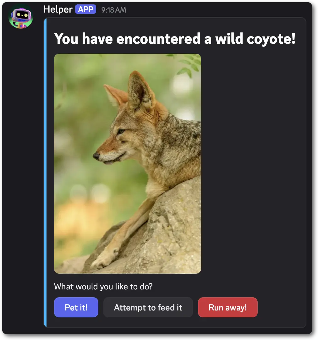 ```jsonc theme={"system"}
{
"flags": 32768,
"components": [
{
"type": 17, // ComponentType.CONTAINER
"accent_color": 703487,
"components": [
{
"type": 10, // ComponentType.TEXT_DISPLAY
"content": "# You have encountered a wild coyote!"
},
{
"type": 12, // ComponentType.MEDIA_GALLERY
"items": [
{
"media": {"url": "https://websitewithopensourceimages/coyote.webp"},
}
]
},
{
"type": 10, // ComponentType.TEXT_DISPLAY
"content": "What would you like to do?"
},
{
"type": 1, // ComponentType.ACTION_ROW
"components": [
{
"type": 2, // ComponentType.BUTTON
"custom_id": "pet_coyote",
"label": "Pet it!",
"style": 1
},
{
"type": 2, // ComponentType.BUTTON
"custom_id": "feed_coyote",
"label": "Attempt to feed it",
"style": 2
},
{
"type": 2, // ComponentType.BUTTON
"custom_id": "run_away",
"label": "Run away!",
"style": 4
}
]
}
]
}
]
}
```
***
## Label
A Label is a top-level layout component. Labels wrap modal components with text as a label and optional description.
The `description` may display above or below the `component` depending on the platform.
###### Label Structure
| Field | Type | Description |
| ------------ | -------------------------------------------------------------------------------------- | -------------------------------------------------------------- |
| type | integer | `18` for a label |
| id? | integer | Optional identifier for component |
| label | string | The label text; max 45 characters |
| description? | string | An optional description text for the label; max 100 characters |
| component | [label child component](/developers/components/reference#label-label-child-components) | The component within the label |
###### Label Child Components
| Available Components |
| ------------------------------------------------------------------------- |
| [Text Input](/developers/components/reference#text-input) |
| [String Select](/developers/components/reference#string-select) |
| [User Select](/developers/components/reference#user-select) |
| [Role Select](/developers/components/reference#role-select) |
| [Mentionable Select](/developers/components/reference#mentionable-select) |
| [Channel Select](/developers/components/reference#channel-select) |
| [File Upload](/developers/components/reference#file-upload) |
| [Radio Group](/developers/components/reference#radio-group) |
| [Checkbox Group](/developers/components/reference#checkbox-group) |
| [Checkbox](/developers/components/reference#checkbox) |
###### Label Interaction Response Structure
| Field | Type | Description |
| --------- | -------------------------------------------------------------------------------------------------------------------------------- | ----------------------------------- |
| type | integer | `18` for a Label |
| id | integer | Unique identifier for the component |
| component | [label interaction response child component](/developers/components/reference#label-label-interaction-response-child-components) | The component within the label |
###### Label Interaction Response Child Components
| Available Components |
| --------------------------------------------------------------------------------------------------------------------------- |
| [Text Input](/developers/components/reference#text-input-text-input-interaction-response-structure) |
| [String Select](/developers/components/reference#string-select-string-select-interaction-response-structure) |
| [User Select](/developers/components/reference#user-select-user-select-interaction-response-structure) |
| [Role Select](/developers/components/reference#role-select-role-select-interaction-response-structure) |
| [Mentionable Select](/developers/components/reference#mentionable-select-mentionable-select-interaction-response-structure) |
| [Channel Select](/developers/components/reference#channel-select-channel-select-interaction-response-structure) |
| [File Upload](/developers/components/reference#file-upload-file-upload-interaction-response-structure) |
| [Radio Group](/developers/components/reference#radio-group-interaction-response-structure) |
| [Checkbox Group](/developers/components/reference#checkbox-group-interaction-response-structure) |
| [Checkbox](/developers/components/reference#checkbox-interaction-response-structure) |
###### Examples
```jsonc theme={"system"}
{
"type": 9, // InteractionCallbackType.MODAL
"data": {
"custom_id": "game_feedback_modal",
"title": "Game Feedback",
"components": [
{
"type": 18, // ComponentType.LABEL
"label": "What did you find interesting about the game?",
"description": "Please give us as much detail as possible so we can improve the game!",
"component": {
"type": 4, // ComponentType.TEXT_INPUT
"custom_id": "game_feedback",
"style": 2,
"min_length": 100,
"max_length": 4000,
"placeholder": "Write your feedback here...",
"required": true
}
}
]
}
}
```
***
## File Upload
File Upload is an interactive component that allows users to upload files in modals. File Uploads can be configured to have a minimum and maximum number of files between 0 and 10, along with `required` for if the upload is required to submit the modal. The max file size a user can upload is based on the user's upload limit in that channel.
File Uploads are available on modals. They must be placed inside a [Label](/developers/components/reference#label).
###### File Upload Structure
| Field | Type | Description |
| -------------- | ------- | ------------------------------------------------------------------------------------------------------ |
| type | integer | `19` for file upload |
| id? | integer | Optional identifier for component |
| custom\_id | string | ID for the file upload; 1-100 characters |
| min\_values?\* | integer | Minimum number of items that must be uploaded (defaults to 1); min 0 (see note), max 10 |
| max\_values? | integer | Maximum number of items that can be uploaded (defaults to 1); max 10 |
| required? | boolean | Whether the file upload requires files to be uploaded before submitting the modal (defaults to `true`) |
\* `min_values` must be either omitted or at least `1` if `required` is omitted or `true`.
###### File Upload Interaction Response Structure
| Field | Type | Description |
| ---------- | ------------------- | ---------------------------------------------------------------------------------------------------------------------------------------------------- |
| type | integer | `19` for a File Upload |
| id | integer | Unique identifier for the component |
| custom\_id | string | Developer-defined identifier for the input; 1-100 characters |
| values | array of snowflakes | IDs of the uploaded files found in the [resolved data](/developers/interactions/receiving-and-responding#interaction-object-resolved-data-structure) |
###### Examples
```jsonc theme={"system"}
{
"flags": 32768,
"components": [
{
"type": 17, // ComponentType.CONTAINER
"accent_color": 703487,
"components": [
{
"type": 10, // ComponentType.TEXT_DISPLAY
"content": "# You have encountered a wild coyote!"
},
{
"type": 12, // ComponentType.MEDIA_GALLERY
"items": [
{
"media": {"url": "https://websitewithopensourceimages/coyote.webp"},
}
]
},
{
"type": 10, // ComponentType.TEXT_DISPLAY
"content": "What would you like to do?"
},
{
"type": 1, // ComponentType.ACTION_ROW
"components": [
{
"type": 2, // ComponentType.BUTTON
"custom_id": "pet_coyote",
"label": "Pet it!",
"style": 1
},
{
"type": 2, // ComponentType.BUTTON
"custom_id": "feed_coyote",
"label": "Attempt to feed it",
"style": 2
},
{
"type": 2, // ComponentType.BUTTON
"custom_id": "run_away",
"label": "Run away!",
"style": 4
}
]
}
]
}
]
}
```
***
## Label
A Label is a top-level layout component. Labels wrap modal components with text as a label and optional description.
The `description` may display above or below the `component` depending on the platform.
###### Label Structure
| Field | Type | Description |
| ------------ | -------------------------------------------------------------------------------------- | -------------------------------------------------------------- |
| type | integer | `18` for a label |
| id? | integer | Optional identifier for component |
| label | string | The label text; max 45 characters |
| description? | string | An optional description text for the label; max 100 characters |
| component | [label child component](/developers/components/reference#label-label-child-components) | The component within the label |
###### Label Child Components
| Available Components |
| ------------------------------------------------------------------------- |
| [Text Input](/developers/components/reference#text-input) |
| [String Select](/developers/components/reference#string-select) |
| [User Select](/developers/components/reference#user-select) |
| [Role Select](/developers/components/reference#role-select) |
| [Mentionable Select](/developers/components/reference#mentionable-select) |
| [Channel Select](/developers/components/reference#channel-select) |
| [File Upload](/developers/components/reference#file-upload) |
| [Radio Group](/developers/components/reference#radio-group) |
| [Checkbox Group](/developers/components/reference#checkbox-group) |
| [Checkbox](/developers/components/reference#checkbox) |
###### Label Interaction Response Structure
| Field | Type | Description |
| --------- | -------------------------------------------------------------------------------------------------------------------------------- | ----------------------------------- |
| type | integer | `18` for a Label |
| id | integer | Unique identifier for the component |
| component | [label interaction response child component](/developers/components/reference#label-label-interaction-response-child-components) | The component within the label |
###### Label Interaction Response Child Components
| Available Components |
| --------------------------------------------------------------------------------------------------------------------------- |
| [Text Input](/developers/components/reference#text-input-text-input-interaction-response-structure) |
| [String Select](/developers/components/reference#string-select-string-select-interaction-response-structure) |
| [User Select](/developers/components/reference#user-select-user-select-interaction-response-structure) |
| [Role Select](/developers/components/reference#role-select-role-select-interaction-response-structure) |
| [Mentionable Select](/developers/components/reference#mentionable-select-mentionable-select-interaction-response-structure) |
| [Channel Select](/developers/components/reference#channel-select-channel-select-interaction-response-structure) |
| [File Upload](/developers/components/reference#file-upload-file-upload-interaction-response-structure) |
| [Radio Group](/developers/components/reference#radio-group-interaction-response-structure) |
| [Checkbox Group](/developers/components/reference#checkbox-group-interaction-response-structure) |
| [Checkbox](/developers/components/reference#checkbox-interaction-response-structure) |
###### Examples
```jsonc theme={"system"}
{
"type": 9, // InteractionCallbackType.MODAL
"data": {
"custom_id": "game_feedback_modal",
"title": "Game Feedback",
"components": [
{
"type": 18, // ComponentType.LABEL
"label": "What did you find interesting about the game?",
"description": "Please give us as much detail as possible so we can improve the game!",
"component": {
"type": 4, // ComponentType.TEXT_INPUT
"custom_id": "game_feedback",
"style": 2,
"min_length": 100,
"max_length": 4000,
"placeholder": "Write your feedback here...",
"required": true
}
}
]
}
}
```
***
## File Upload
File Upload is an interactive component that allows users to upload files in modals. File Uploads can be configured to have a minimum and maximum number of files between 0 and 10, along with `required` for if the upload is required to submit the modal. The max file size a user can upload is based on the user's upload limit in that channel.
File Uploads are available on modals. They must be placed inside a [Label](/developers/components/reference#label).
###### File Upload Structure
| Field | Type | Description |
| -------------- | ------- | ------------------------------------------------------------------------------------------------------ |
| type | integer | `19` for file upload |
| id? | integer | Optional identifier for component |
| custom\_id | string | ID for the file upload; 1-100 characters |
| min\_values?\* | integer | Minimum number of items that must be uploaded (defaults to 1); min 0 (see note), max 10 |
| max\_values? | integer | Maximum number of items that can be uploaded (defaults to 1); max 10 |
| required? | boolean | Whether the file upload requires files to be uploaded before submitting the modal (defaults to `true`) |
\* `min_values` must be either omitted or at least `1` if `required` is omitted or `true`.
###### File Upload Interaction Response Structure
| Field | Type | Description |
| ---------- | ------------------- | ---------------------------------------------------------------------------------------------------------------------------------------------------- |
| type | integer | `19` for a File Upload |
| id | integer | Unique identifier for the component |
| custom\_id | string | Developer-defined identifier for the input; 1-100 characters |
| values | array of snowflakes | IDs of the uploaded files found in the [resolved data](/developers/interactions/receiving-and-responding#interaction-object-resolved-data-structure) |
###### Examples
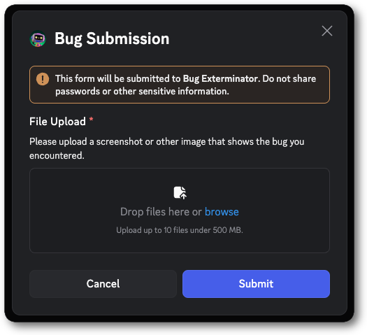 ```jsonc theme={"system"}
{
"type": 9,
"data": {
"custom_id": "bug_submit_modal",
"title": "Bug Submission",
"components": [
{
"type": 18, // ComponentType.LABEL
"label": "File Upload",
"description": "Please upload a screenshot or other image that shows the bug you encountered.",
"component": {
"type": 19, // ComponentType.FILE_UPLOAD
"custom_id": "file_upload",
"min_values": 1,
"max_values": 10,
"required": true
}
}
]
}
}
```
When a user submits a modal that contains a File Upload, this is the basic form of the interaction data payload you will receive. The full payload
is available in the [interaction](/developers/interactions/receiving-and-responding#interaction-object-interaction-structure) reference.
```jsonc theme={"system"}
{
"type": 5, // InteractionType.MODAL_SUBMIT
...additionalInteractionFields, // See the Interaction documentation for all fields
"data": {
"components": [
{
"component": {
"custom_id": "file_upload",
"id": 2,
"type": 19,
"values": [
"111111111111111111111"
]
},
"id": 1,
"type": 18
}
],
"custom_id": "bug_submit_modal",
"resolved": {
"attachments": {
"111111111111111111111": {
"content_type": "image/png",
"ephemeral": true,
"filename": "bug.png",
"height": 604,
"id": "111111111111111111111",
"placeholder": "/PcBAoBQydvKesabEIoMsdg=",
"placeholder_version": 1,
"proxy_url": "https://media.discordapp.net/ephemeral-attachments/2222222222222222222/111111111111111111111/bug.png?ex=68dc7ce1&is=68db2b61&hm=5954f90117ccf8716ffa6c7f97a778a0d039810c9584045f400d8a9fff590768&",
"size": 241394,
"url": "https://cdn.discordapp.com/ephemeral-attachments/2222222222222222222/111111111111111111111/bug.png?ex=68dc7ce1&is=68db2b61&hm=5954f90117ccf8716ffa6c7f97a778a0d039810c9584045f400d8a9fff590768&",
"width": 2482
}
}
}
}
}
```
***
## Radio Group
A Radio Group is an interactive component for selecting exactly one option from a defined list. Radio Groups are available in modals and must be placed inside a [Label](/developers/components/reference#label).
### Radio Group Structure
| Field | Type | Description |
| ---------- | --------------------------------------------------------------------------------------------- | ------------------------------------------------------------------------ |
| type | integer | `21` for radio group |
| id? | integer | Optional identifier for component |
| custom\_id | string | Developer-defined identifier for the input; 1-100 characters |
| options | array of [radio group options](/developers/components/reference#radio-group-option-structure) | List of options to show; min 2, max 10 |
| required? | boolean | Whether a selection is required to submit the modal (defaults to `true`) |
### Radio Group Option Structure
| Field | Type | Description |
| ------------ | ------- | ------------------------------------------------------- |
| value | string | Dev-defined value of the option; max 100 characters |
| label | string | User-facing label of the option; max 100 characters |
| description? | string | Optional description for the option; max 100 characters |
| default? | boolean | Shows the option as selected by default |
### Radio Group Interaction Response Structure
| Field | Type | Description |
| ---------- | ------- | -------------------------------------------------------------------- |
| type | integer | `21` for a Radio Group |
| id | integer | Unique identifier for the component |
| custom\_id | string | Developer-defined identifier for the input; 1-100 characters |
| value | ?string | The value of the selected option, or `null` if no option is selected |
### Examples
```jsonc theme={"system"}
{
"type": 9,
"data": {
"custom_id": "bug_submit_modal",
"title": "Bug Submission",
"components": [
{
"type": 18, // ComponentType.LABEL
"label": "File Upload",
"description": "Please upload a screenshot or other image that shows the bug you encountered.",
"component": {
"type": 19, // ComponentType.FILE_UPLOAD
"custom_id": "file_upload",
"min_values": 1,
"max_values": 10,
"required": true
}
}
]
}
}
```
When a user submits a modal that contains a File Upload, this is the basic form of the interaction data payload you will receive. The full payload
is available in the [interaction](/developers/interactions/receiving-and-responding#interaction-object-interaction-structure) reference.
```jsonc theme={"system"}
{
"type": 5, // InteractionType.MODAL_SUBMIT
...additionalInteractionFields, // See the Interaction documentation for all fields
"data": {
"components": [
{
"component": {
"custom_id": "file_upload",
"id": 2,
"type": 19,
"values": [
"111111111111111111111"
]
},
"id": 1,
"type": 18
}
],
"custom_id": "bug_submit_modal",
"resolved": {
"attachments": {
"111111111111111111111": {
"content_type": "image/png",
"ephemeral": true,
"filename": "bug.png",
"height": 604,
"id": "111111111111111111111",
"placeholder": "/PcBAoBQydvKesabEIoMsdg=",
"placeholder_version": 1,
"proxy_url": "https://media.discordapp.net/ephemeral-attachments/2222222222222222222/111111111111111111111/bug.png?ex=68dc7ce1&is=68db2b61&hm=5954f90117ccf8716ffa6c7f97a778a0d039810c9584045f400d8a9fff590768&",
"size": 241394,
"url": "https://cdn.discordapp.com/ephemeral-attachments/2222222222222222222/111111111111111111111/bug.png?ex=68dc7ce1&is=68db2b61&hm=5954f90117ccf8716ffa6c7f97a778a0d039810c9584045f400d8a9fff590768&",
"width": 2482
}
}
}
}
}
```
***
## Radio Group
A Radio Group is an interactive component for selecting exactly one option from a defined list. Radio Groups are available in modals and must be placed inside a [Label](/developers/components/reference#label).
### Radio Group Structure
| Field | Type | Description |
| ---------- | --------------------------------------------------------------------------------------------- | ------------------------------------------------------------------------ |
| type | integer | `21` for radio group |
| id? | integer | Optional identifier for component |
| custom\_id | string | Developer-defined identifier for the input; 1-100 characters |
| options | array of [radio group options](/developers/components/reference#radio-group-option-structure) | List of options to show; min 2, max 10 |
| required? | boolean | Whether a selection is required to submit the modal (defaults to `true`) |
### Radio Group Option Structure
| Field | Type | Description |
| ------------ | ------- | ------------------------------------------------------- |
| value | string | Dev-defined value of the option; max 100 characters |
| label | string | User-facing label of the option; max 100 characters |
| description? | string | Optional description for the option; max 100 characters |
| default? | boolean | Shows the option as selected by default |
### Radio Group Interaction Response Structure
| Field | Type | Description |
| ---------- | ------- | -------------------------------------------------------------------- |
| type | integer | `21` for a Radio Group |
| id | integer | Unique identifier for the component |
| custom\_id | string | Developer-defined identifier for the input; 1-100 characters |
| value | ?string | The value of the selected option, or `null` if no option is selected |
### Examples
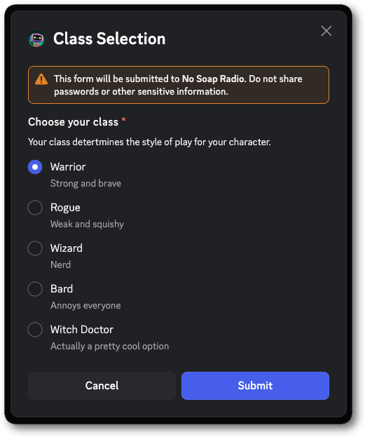 ```jsonc theme={"system"}
{
"type": 9,
"data": {
"custom_id": "class_selection_modal",
"title": "Class Selection",
"components": [
{
"type": 18, // ComponentType.LABEL
"label": "Choose your class",
"description": "Your class detertmines the style of play for your character.",
"component": {
"type": 21, // ComponentType.RADIO_GROUP
"custom_id": "class_radio",
"options": [
{"value": "warrior", "label": "Warrior", "description": "Strong and brave"},
{"value": "rogue", "label": "Rogue", "description": "Weak and squishy"},
{"value": "wizard", "label": "Wizard", "description": "Nerd"},
{"value": "bard", "label": "Bard", "description": "Annoys everyone"},
{"value": "witch_doctor", "label": "Witch Doctor", "description": "Actually a pretty cool option"}
]
}
}
]
}
}
```
```jsonc theme={"system"}
{
"type": 5, // InteractionType.MODAL_SUBMIT
...additionalInteractionFields, // See the Interaction documentation for all fields
"data": {
"custom_id": "class_selection_modal",
"components": [
{
"id": 1,
"type": 18, // ComponentType.LABEL
"component": {
"custom_id": "class_radio",
"id": 2,
"type": 21, // ComponentType.RADIO_GROUP
"value": "warrior"
}
}
]
}
}
```
***
## Checkbox Group
A Checkbox Group is an interactive component for selecting one or many options via checkboxes. Checkbox Groups are available in modals and must be placed inside a [Label](/developers/components/reference#label).
### Checkbox Group Structure
| Field | Type | Description |
| -------------- | --------------------------------------------------------------------------------------------------- | --------------------------------------------------------------------------------------------- |
| type | integer | `22` for checkbox group |
| id? | integer | Optional identifier for component |
| custom\_id | string | Developer-defined identifier for the input; 1-100 characters |
| options | array of [checkbox group options](/developers/components/reference#checkbox-group-option-structure) | List of options to show; min 1, max 10 |
| min\_values?\* | integer | Minimum number of items that must be chosen; min 0, max 10 (defaults to 1); |
| max\_values? | integer | Maximum number of items that can be chosen; min 1, max 10 (defaults to the number of options) |
| required? | boolean | Whether selecting within the group is required (defaults to `true`) |
\* `min_values` must be either omitted or at least `1` if `required` is omitted or `true`.
### Checkbox Group Option Structure
| Field | Type | Description |
| ------------ | ------- | ------------------------------------------------------- |
| value | string | Dev-defined value of the option; max 100 characters |
| label | string | User-facing label of the option; max 100 characters |
| description? | string | Optional description for the option; max 100 characters |
| default? | boolean | Shows the option as selected by default |
### Checkbox Group Interaction Response Structure
| Field | Type | Description |
| ---------- | ---------------- | ------------------------------------------------------------------------------------- |
| type | integer | `22` for a Checkbox Group |
| id | integer | Unique identifier for the component |
| custom\_id | string | Developer-defined identifier for the input; 1-100 characters |
| values | array of strings | The values of the selected options, or an empty array `[]` if no options are selected |
### Examples
```jsonc theme={"system"}
{
"type": 9,
"data": {
"custom_id": "class_selection_modal",
"title": "Class Selection",
"components": [
{
"type": 18, // ComponentType.LABEL
"label": "Choose your class",
"description": "Your class detertmines the style of play for your character.",
"component": {
"type": 21, // ComponentType.RADIO_GROUP
"custom_id": "class_radio",
"options": [
{"value": "warrior", "label": "Warrior", "description": "Strong and brave"},
{"value": "rogue", "label": "Rogue", "description": "Weak and squishy"},
{"value": "wizard", "label": "Wizard", "description": "Nerd"},
{"value": "bard", "label": "Bard", "description": "Annoys everyone"},
{"value": "witch_doctor", "label": "Witch Doctor", "description": "Actually a pretty cool option"}
]
}
}
]
}
}
```
```jsonc theme={"system"}
{
"type": 5, // InteractionType.MODAL_SUBMIT
...additionalInteractionFields, // See the Interaction documentation for all fields
"data": {
"custom_id": "class_selection_modal",
"components": [
{
"id": 1,
"type": 18, // ComponentType.LABEL
"component": {
"custom_id": "class_radio",
"id": 2,
"type": 21, // ComponentType.RADIO_GROUP
"value": "warrior"
}
}
]
}
}
```
***
## Checkbox Group
A Checkbox Group is an interactive component for selecting one or many options via checkboxes. Checkbox Groups are available in modals and must be placed inside a [Label](/developers/components/reference#label).
### Checkbox Group Structure
| Field | Type | Description |
| -------------- | --------------------------------------------------------------------------------------------------- | --------------------------------------------------------------------------------------------- |
| type | integer | `22` for checkbox group |
| id? | integer | Optional identifier for component |
| custom\_id | string | Developer-defined identifier for the input; 1-100 characters |
| options | array of [checkbox group options](/developers/components/reference#checkbox-group-option-structure) | List of options to show; min 1, max 10 |
| min\_values?\* | integer | Minimum number of items that must be chosen; min 0, max 10 (defaults to 1); |
| max\_values? | integer | Maximum number of items that can be chosen; min 1, max 10 (defaults to the number of options) |
| required? | boolean | Whether selecting within the group is required (defaults to `true`) |
\* `min_values` must be either omitted or at least `1` if `required` is omitted or `true`.
### Checkbox Group Option Structure
| Field | Type | Description |
| ------------ | ------- | ------------------------------------------------------- |
| value | string | Dev-defined value of the option; max 100 characters |
| label | string | User-facing label of the option; max 100 characters |
| description? | string | Optional description for the option; max 100 characters |
| default? | boolean | Shows the option as selected by default |
### Checkbox Group Interaction Response Structure
| Field | Type | Description |
| ---------- | ---------------- | ------------------------------------------------------------------------------------- |
| type | integer | `22` for a Checkbox Group |
| id | integer | Unique identifier for the component |
| custom\_id | string | Developer-defined identifier for the input; 1-100 characters |
| values | array of strings | The values of the selected options, or an empty array `[]` if no options are selected |
### Examples
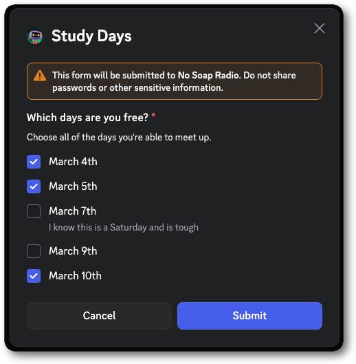 ```jsonc theme={"system"}
{
"type": 9,
"data": {
"custom_id": "day_selection_modal",
"title": "Study Days",
"components": [
{
"type": 18, // ComponentType.LABEL
"label": "Which days are you free?",
"description": "Choose all of the days you're able to meet up.",
"component": {
"type": 22, // ComponentType.CHECKBOX_GROUP
"custom_id": "event_checkbox",
"options": [
{"value": "march-4", "label": "March 4th"},
{"value": "march-5", "label": "March 5th"},
{"value": "march-7", "label": "March 7th", "description": "I know this is a Saturday and is tough"},
{"value": "march-9", "label": "March 9th"},
{"value": "march-10", "label": "March 10th"}
]
}
}
]
}
}
```
```jsonc theme={"system"}
{
"type": 5, // InteractionType.MODAL_SUBMIT
...additionalInteractionFields, // See the Interaction documentation for all fields
"data": {
"custom_id": "day_selection_modal",
"components": [
{
"id": 1,
"type": 18, // ComponentType.LABEL
"component": {
"custom_id": "event_checkbox",
"id": 2,
"type": 22, // ComponentType.CHECKBOX_GROUP
"values": [
"march-5",
"march-10",
"march-4"
]
}
}
]
}
}
```
***
## Checkbox
A Checkbox is a single interactive component for simple yes/no style questions. Checkboxes are available in modals and must be placed inside a [Label](/developers/components/reference#label).
### Checkbox Structure
| Field | Type | Description |
| ---------- | ------- | ------------------------------------------------------------ |
| type | integer | `23` for checkbox |
| id? | integer | Optional identifier for component |
| custom\_id | string | Developer-defined identifier for the input; 1-100 characters |
| default? | boolean | Whether the checkbox is selected by default |
While you can't set a checkbox as required, you can use a [Checkbox Group](/developers/components/reference#checkbox-group) with a single option and `required` to achieve similar functionality.
### Checkbox Interaction Response Structure
| Field | Type | Description |
| ---------- | ------- | ------------------------------------------------------------------- |
| type | integer | `23` for a Checkbox |
| id | integer | Unique identifier for the component |
| custom\_id | string | Developer-defined identifier for the input; 1-100 characters |
| value | boolean | The state of the checkbox (`true` if checked, `false` if unchecked) |
### Examples
```jsonc theme={"system"}
{
"type": 9,
"data": {
"custom_id": "day_selection_modal",
"title": "Study Days",
"components": [
{
"type": 18, // ComponentType.LABEL
"label": "Which days are you free?",
"description": "Choose all of the days you're able to meet up.",
"component": {
"type": 22, // ComponentType.CHECKBOX_GROUP
"custom_id": "event_checkbox",
"options": [
{"value": "march-4", "label": "March 4th"},
{"value": "march-5", "label": "March 5th"},
{"value": "march-7", "label": "March 7th", "description": "I know this is a Saturday and is tough"},
{"value": "march-9", "label": "March 9th"},
{"value": "march-10", "label": "March 10th"}
]
}
}
]
}
}
```
```jsonc theme={"system"}
{
"type": 5, // InteractionType.MODAL_SUBMIT
...additionalInteractionFields, // See the Interaction documentation for all fields
"data": {
"custom_id": "day_selection_modal",
"components": [
{
"id": 1,
"type": 18, // ComponentType.LABEL
"component": {
"custom_id": "event_checkbox",
"id": 2,
"type": 22, // ComponentType.CHECKBOX_GROUP
"values": [
"march-5",
"march-10",
"march-4"
]
}
}
]
}
}
```
***
## Checkbox
A Checkbox is a single interactive component for simple yes/no style questions. Checkboxes are available in modals and must be placed inside a [Label](/developers/components/reference#label).
### Checkbox Structure
| Field | Type | Description |
| ---------- | ------- | ------------------------------------------------------------ |
| type | integer | `23` for checkbox |
| id? | integer | Optional identifier for component |
| custom\_id | string | Developer-defined identifier for the input; 1-100 characters |
| default? | boolean | Whether the checkbox is selected by default |
While you can't set a checkbox as required, you can use a [Checkbox Group](/developers/components/reference#checkbox-group) with a single option and `required` to achieve similar functionality.
### Checkbox Interaction Response Structure
| Field | Type | Description |
| ---------- | ------- | ------------------------------------------------------------------- |
| type | integer | `23` for a Checkbox |
| id | integer | Unique identifier for the component |
| custom\_id | string | Developer-defined identifier for the input; 1-100 characters |
| value | boolean | The state of the checkbox (`true` if checked, `false` if unchecked) |
### Examples
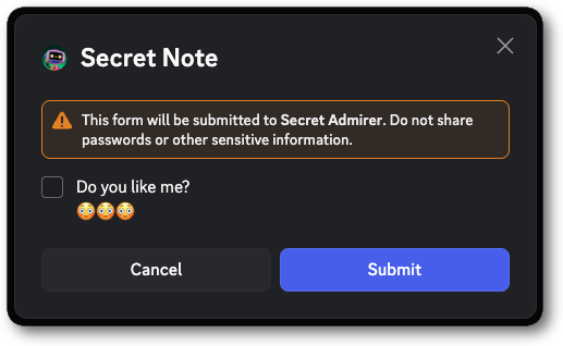 ```jsonc theme={"system"}
{
"type": 9,
"data": {
"custom_id": "secret_note_modal",
"title": "Secret Note",
"components": [
{
"type": 18, // ComponentType.LABEL
"label": "Do you like me?",
"description": "😳😳😳",
"component": {
"type": 23, // ComponentType.CHECKBOX
"custom_id": "like_checkbox"
}
}
]
}
}
```
```jsonc theme={"system"}
{
"type": 5, // InteractionType.MODAL_SUBMIT
...additionalInteractionFields, // See the Interaction documentation for all fields
"data": {
"custom_id": "secret_note_modal",
"components": [
{
"id": 1,
"type": 18, // ComponentType.LABEL
"component": {
"custom_id": "like_checkbox",
"id": 2,
"type": 23, // ComponentType.CHECKBOX
"value": true
}
}
]
}
}
```
***
## Unfurled Media Item
An Unfurled Media Item is a piece of media, represented by a URL, that is used within a component. It can be
constructed via either uploading media to Discord, or by referencing external media via **a direct link** to the asset.
While the structure below is the full representation of an Unfurled Media Item,
**only the `url` field is settable by developers** when making requests that utilize this structure.
All other fields will be automatically populated by Discord.
###### Unfurled Media Item Structure
| Field | Type | Description |
| ------------------------ | --------- | ----------------------------------------------------------------------------------------------------------------------------------------------------------------------------- |
| url | string | Supports arbitrary urls and `attachment://` references |
| proxy\_url? \* | string | The proxied url of the media item |
| height? \* | ?integer | The height of the media item (if image or video) |
| width? \* | ?integer | The width of the media item (if image or video) |
| placeholder? \* | string | [Thumbhash](https://evanw.github.io/thumbhash/) placeholder (if image or video) |
| placeholder\_version? \* | integer | Version of the placeholder (if image or video) |
| content\_type? \* | string | The [media type](https://en.wikipedia.org/wiki/Media_type) of the content |
| flags? \* | integer | [Unfurled media item flags](/developers/components/reference#unfurled-media-item-unfurled-media-item-flags) combined as a [bitfield](https://en.wikipedia.org/wiki/Bit_field) |
| attachment\_id? \* \*\* | snowflake | The id of the uploaded attachment |
\* This field is ignored and provided by the API as part of the response.
\*\* Only present if the media item was uploaded as an attachment.
###### Unfurled Media Item Flags
| Flag | Value | Description |
| ------------ | -------- | ---------------------- |
| IS\_ANIMATED | `1 << 0` | This image is animated |
### Uploading a file
To upload a file with your message, you'll need to send your payload as `multipart/form-data` (rather than `application/json`) and include your file with a valid filename in your payload. Details and examples for uploading files can be found in the [API Reference](/developers/reference#uploading-files).
## Legacy Message Component Behavior
Before the introduction of the `IS_COMPONENTS_V2` flag ([see changelog](/developers/change-log#introducing-new-components-for-messages)), message components were sent in conjunction with message content. This means that you could send a message using a subset of the available components without setting the `IS_COMPONENTS_V2` flag, and the components would be included in the message content along with `content` and `embeds`.
Additionally, components of messages preceding components V2 will contain an `id` of `0`.
Apps using this Legacy Message Component behavior will continue to work as expected, but it is recommended to use the new `IS_COMPONENTS_V2` flag for new apps or features as they offer more options for layout and customization.
Legacy messages allow up to 5 action rows as top-level components
Legacy Message Component Example
```jsonc theme={"system"}
{
"content": "This is a message with legacy components",
"components": [
{
"type": 1,
"components": [
{
"type": 2,
"style": 1,
"label": "Click Me",
"custom_id": "click_me_1"
}
]
}
]
}
```
```jsonc theme={"system"}
{
"type": 9,
"data": {
"custom_id": "secret_note_modal",
"title": "Secret Note",
"components": [
{
"type": 18, // ComponentType.LABEL
"label": "Do you like me?",
"description": "😳😳😳",
"component": {
"type": 23, // ComponentType.CHECKBOX
"custom_id": "like_checkbox"
}
}
]
}
}
```
```jsonc theme={"system"}
{
"type": 5, // InteractionType.MODAL_SUBMIT
...additionalInteractionFields, // See the Interaction documentation for all fields
"data": {
"custom_id": "secret_note_modal",
"components": [
{
"id": 1,
"type": 18, // ComponentType.LABEL
"component": {
"custom_id": "like_checkbox",
"id": 2,
"type": 23, // ComponentType.CHECKBOX
"value": true
}
}
]
}
}
```
***
## Unfurled Media Item
An Unfurled Media Item is a piece of media, represented by a URL, that is used within a component. It can be
constructed via either uploading media to Discord, or by referencing external media via **a direct link** to the asset.
While the structure below is the full representation of an Unfurled Media Item,
**only the `url` field is settable by developers** when making requests that utilize this structure.
All other fields will be automatically populated by Discord.
###### Unfurled Media Item Structure
| Field | Type | Description |
| ------------------------ | --------- | ----------------------------------------------------------------------------------------------------------------------------------------------------------------------------- |
| url | string | Supports arbitrary urls and `attachment://` references |
| proxy\_url? \* | string | The proxied url of the media item |
| height? \* | ?integer | The height of the media item (if image or video) |
| width? \* | ?integer | The width of the media item (if image or video) |
| placeholder? \* | string | [Thumbhash](https://evanw.github.io/thumbhash/) placeholder (if image or video) |
| placeholder\_version? \* | integer | Version of the placeholder (if image or video) |
| content\_type? \* | string | The [media type](https://en.wikipedia.org/wiki/Media_type) of the content |
| flags? \* | integer | [Unfurled media item flags](/developers/components/reference#unfurled-media-item-unfurled-media-item-flags) combined as a [bitfield](https://en.wikipedia.org/wiki/Bit_field) |
| attachment\_id? \* \*\* | snowflake | The id of the uploaded attachment |
\* This field is ignored and provided by the API as part of the response.
\*\* Only present if the media item was uploaded as an attachment.
###### Unfurled Media Item Flags
| Flag | Value | Description |
| ------------ | -------- | ---------------------- |
| IS\_ANIMATED | `1 << 0` | This image is animated |
### Uploading a file
To upload a file with your message, you'll need to send your payload as `multipart/form-data` (rather than `application/json`) and include your file with a valid filename in your payload. Details and examples for uploading files can be found in the [API Reference](/developers/reference#uploading-files).
## Legacy Message Component Behavior
Before the introduction of the `IS_COMPONENTS_V2` flag ([see changelog](/developers/change-log#introducing-new-components-for-messages)), message components were sent in conjunction with message content. This means that you could send a message using a subset of the available components without setting the `IS_COMPONENTS_V2` flag, and the components would be included in the message content along with `content` and `embeds`.
Additionally, components of messages preceding components V2 will contain an `id` of `0`.
Apps using this Legacy Message Component behavior will continue to work as expected, but it is recommended to use the new `IS_COMPONENTS_V2` flag for new apps or features as they offer more options for layout and customization.
Legacy messages allow up to 5 action rows as top-level components
Legacy Message Component Example
```jsonc theme={"system"}
{
"content": "This is a message with legacy components",
"components": [
{
"type": 1,
"components": [
{
"type": 2,
"style": 1,
"label": "Click Me",
"custom_id": "click_me_1"
}
]
}
]
}
```